Just Like Home
package design

Overview

Featuring rich flavours culturally inspired by countries across Asia, this project aims to challenge the negative associations with instant soup by adding sophistication while maintaining the ease-of-use the product is recognized for.

This was a solo project in which I conducted research, ideated concepts, designed the visuals, and produced the physical product. In addition, I also photographed and edited the final images.

Type

Package Design

Timeline

September–December 2021 (8 weeks)

Tools

Illustrator / InDesign / Photoshop

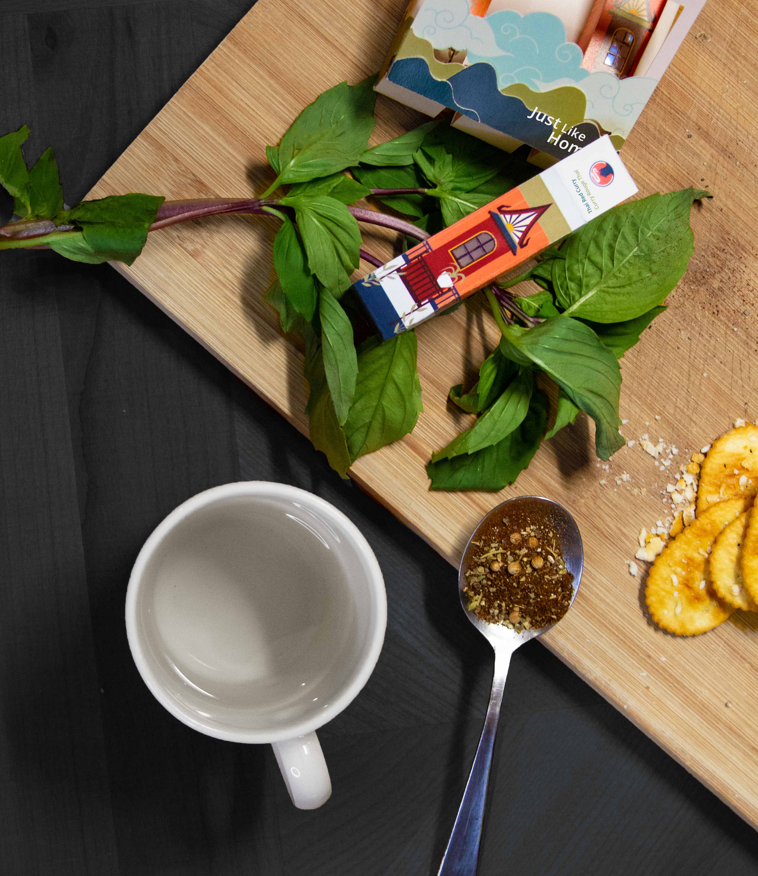
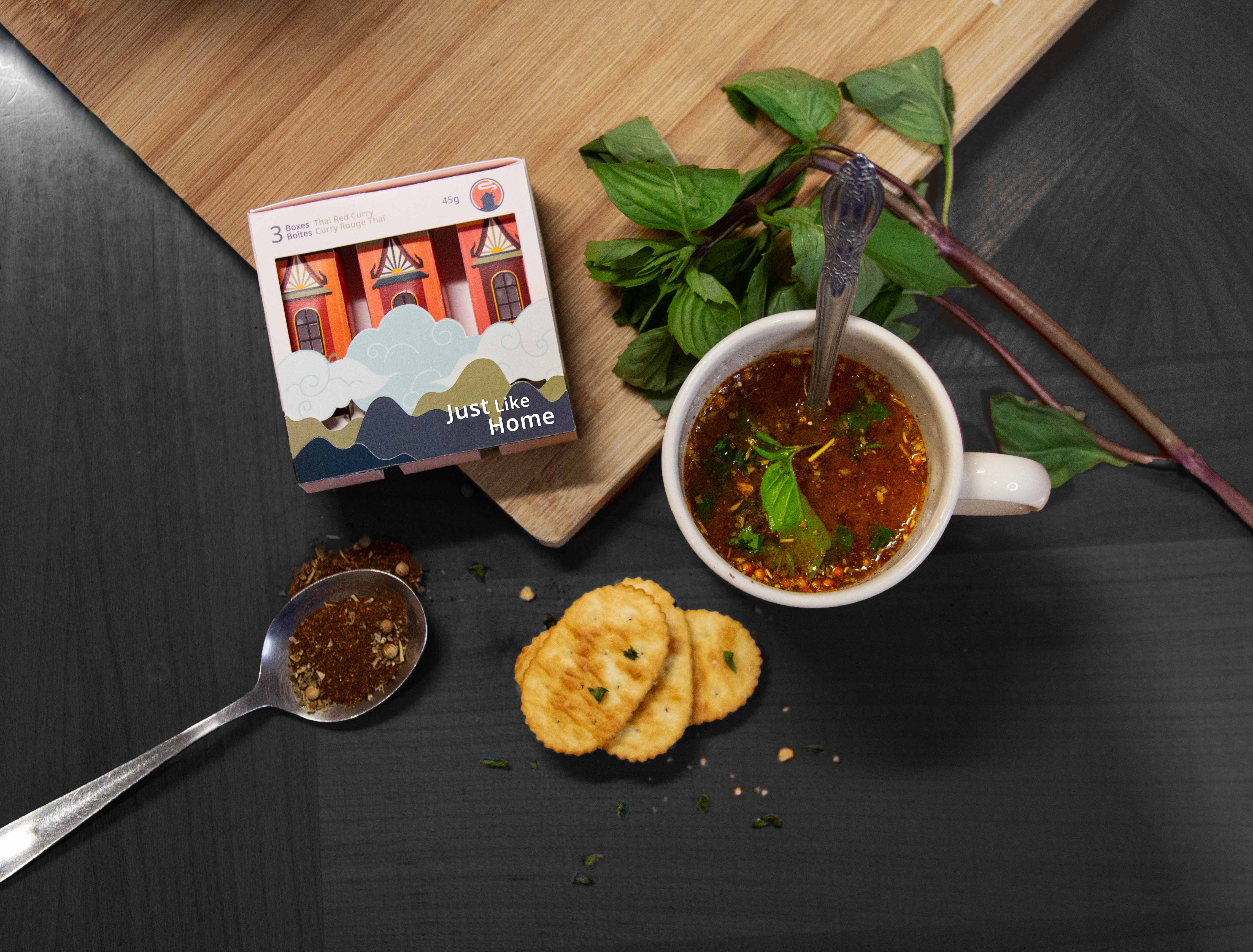
Propped shot of the container on a cutting board

Challenge

Around the globe, freshly brewed soup is universally regarded as comfort food and is often reminiscent of the familiar feeling of home. Contrarily, purchased for cooking convenience and efficiency, instant soup does not carry the same associations as the original products.

Solution

While considering the consoling nature of soup, Just Like Home soup had been created to introduce young adults with busy schedules to a few of the many vibrant flavours across the world. The visual designs reflect historically significant buildings within the flavour’s respective country, indicating that “home” can be anywhere—as it is a feeling, rather than a geographical location.

The Final Product

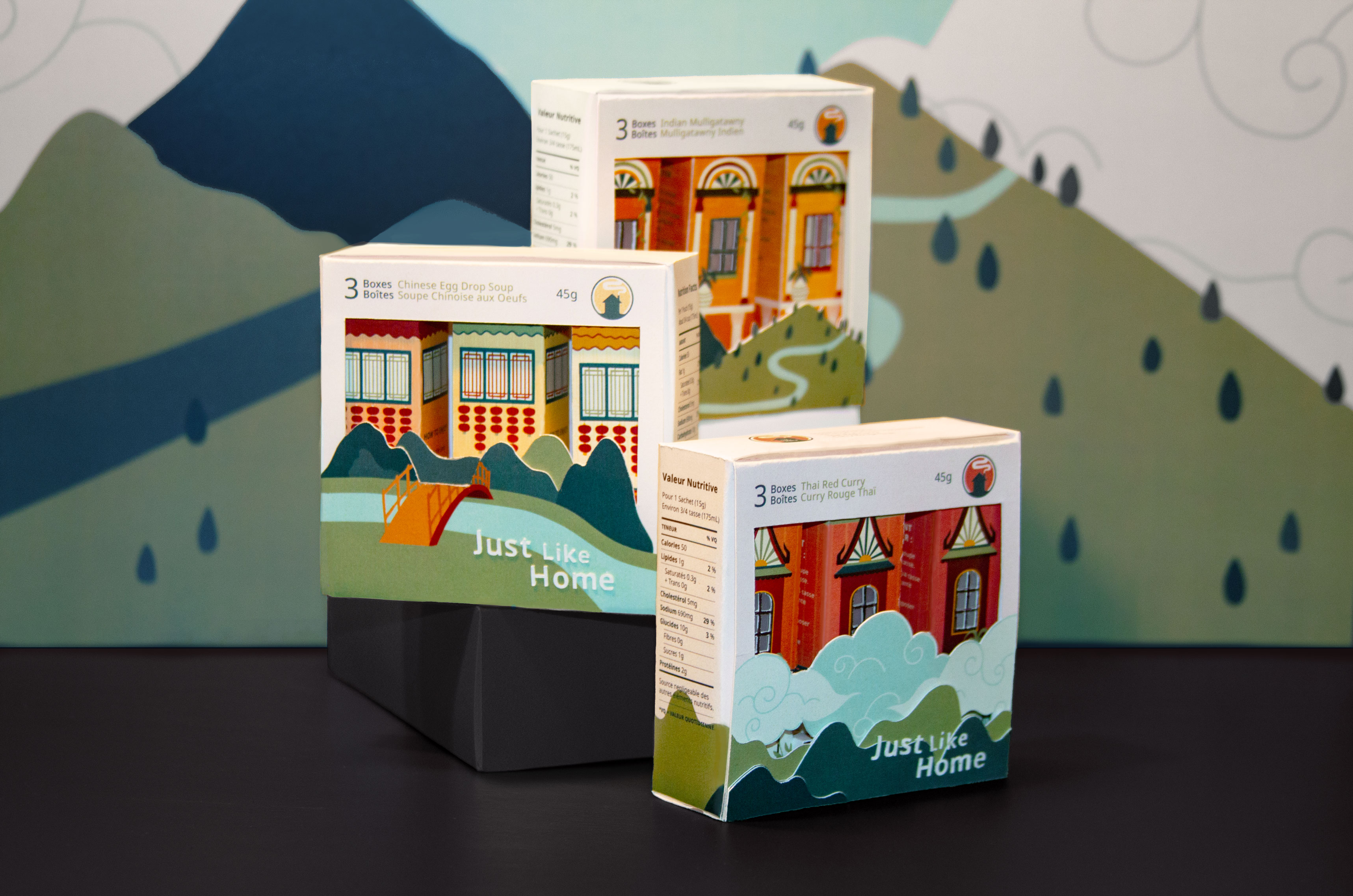
Display of three boxes

Flavours

I designed packaging for three flavours inspired by countries across Asia: Chinese Egg Drop Soup, Indian Mulligatawny, and Thai Red Curry. Without having to sacrifice comfort, Just Like Home soup elevates an everyday product to encourage consumers to expand their boundaries and treat their tastebuds.

Final produced sets

Process

Research

I began by researching the original Lipton Cup-a-Soup product and competitors. I made note of the product descriptions, highlighted features, cooking directions and flavours. I also looked into various soup flavours and the cultures of the countries associated with them. The three types of research I performed were:

Market Research

To compare existing instant soup packaging.

Cultural Research

For ways of showing culture through design.

Visual Research

To inspire lively and visually appealing packaging.

Ideation

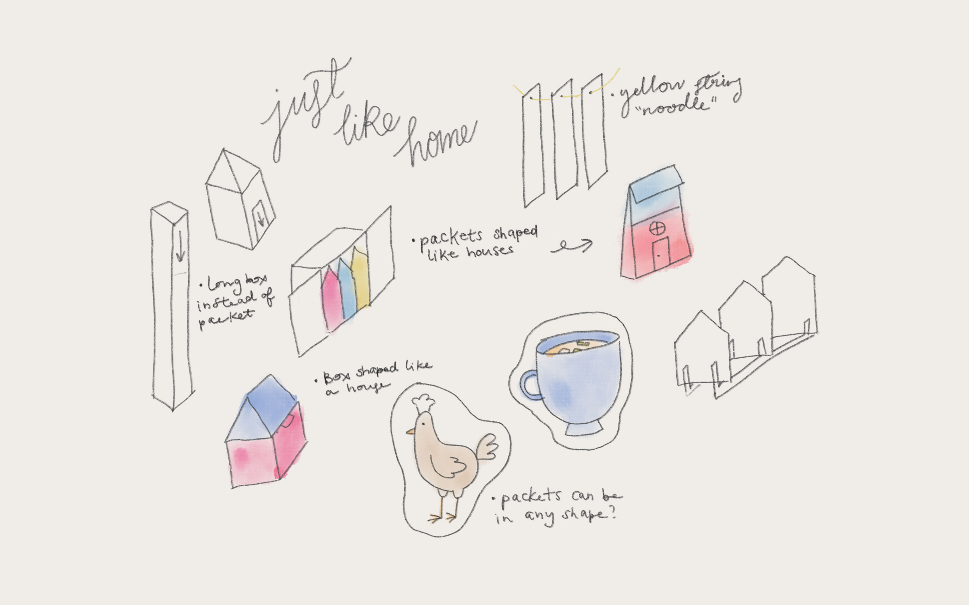
Taking the research and qualities of the product into consideration, I solidified a general direction for the package design project. I quickly explored a few directions and decided to reflect the idea of “home” through illustrations, presented as houses inspired by different locations.

Quick concept sketches

Sizing

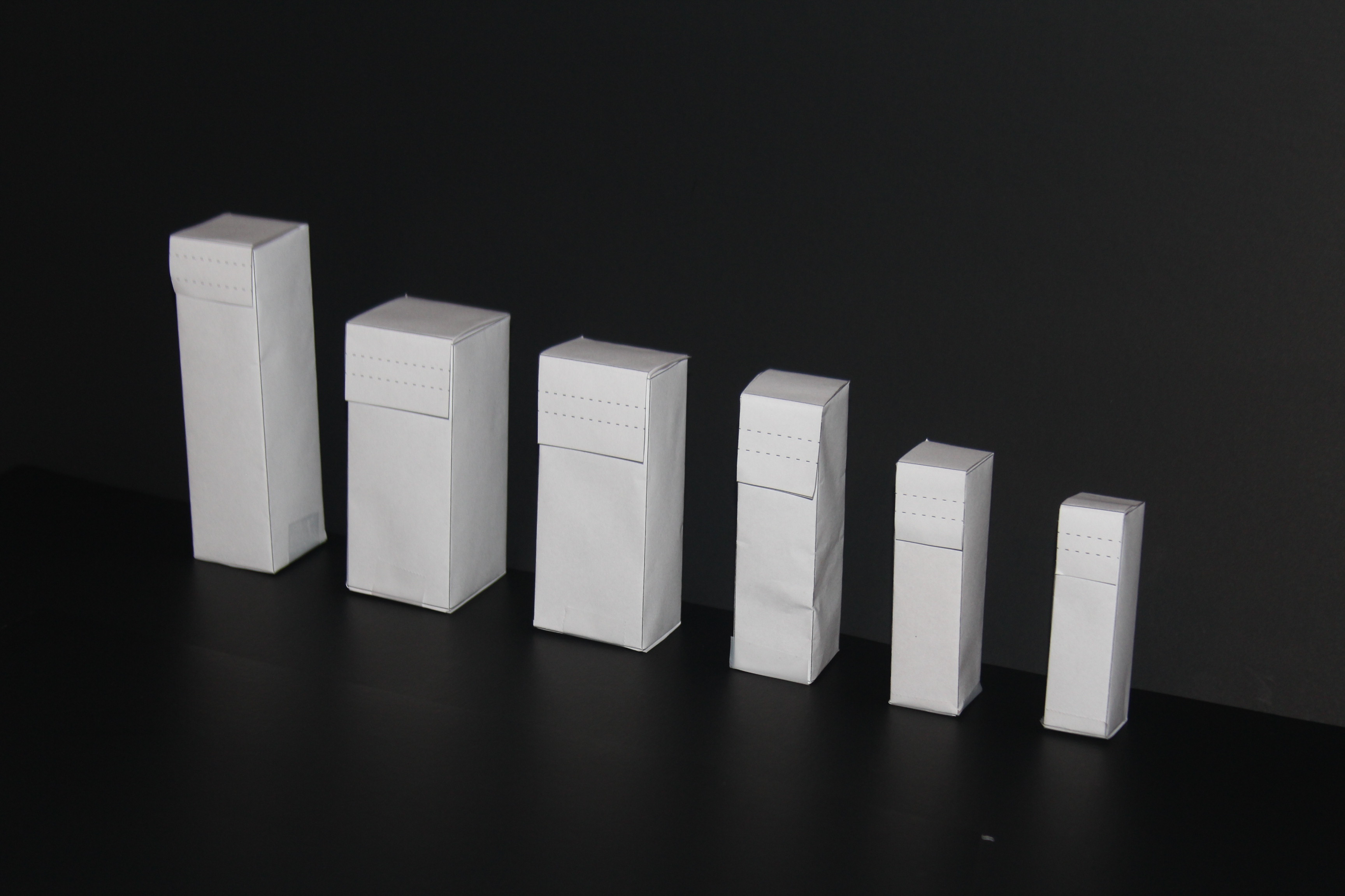
Through a trial-and-error process, I determined the optimal dimensions for each packet. The final container is large enough to fit all of the contents, leaving around 1 centimetre of space at the top, so the consumer can open the box without making a mess. The final dimensions were 2.2cm L x 2.2cm W x 7.6cm H for a serving size of 15g.

Exploration of container sizing

Branding

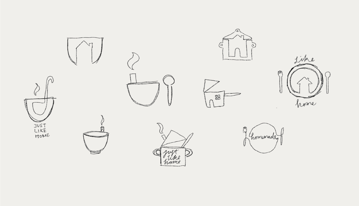
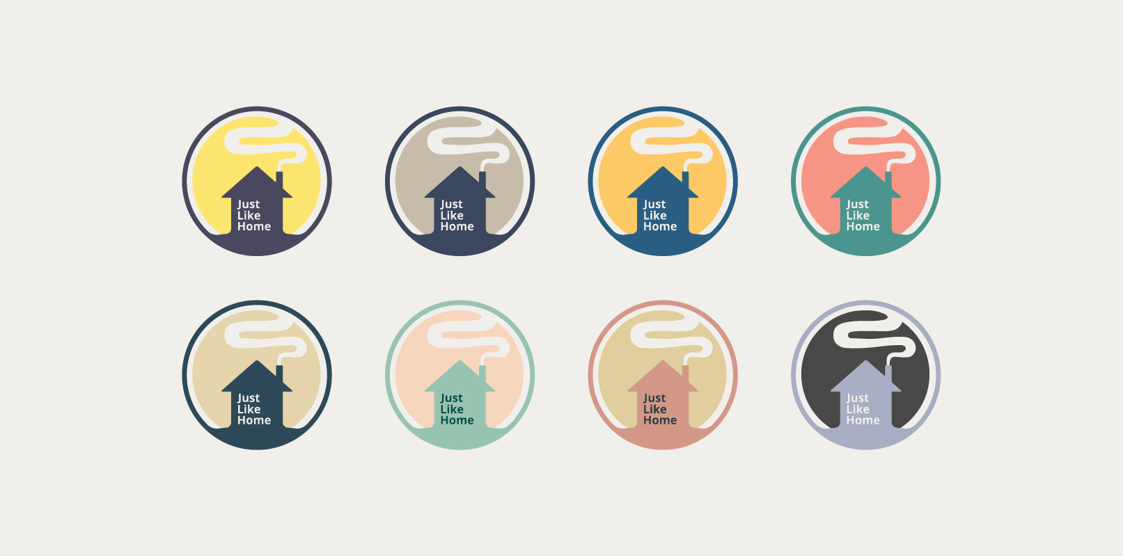
Various ideas were sketched out, all aiming to be reminiscent of the product and concept. The final logo combines a house with a dish, emitting smoke from a chimney to symbolize comfort and warmth.

Logo sketches Logo colours

Dieline

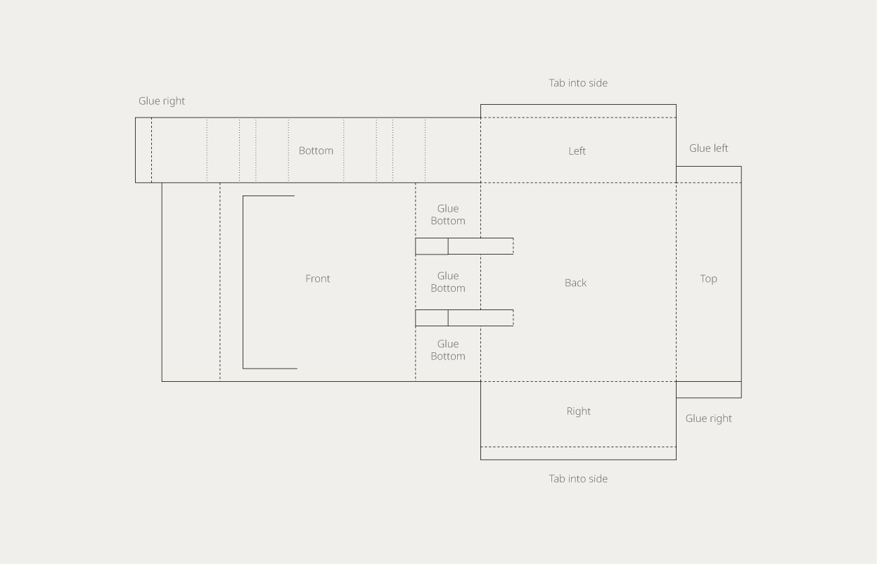
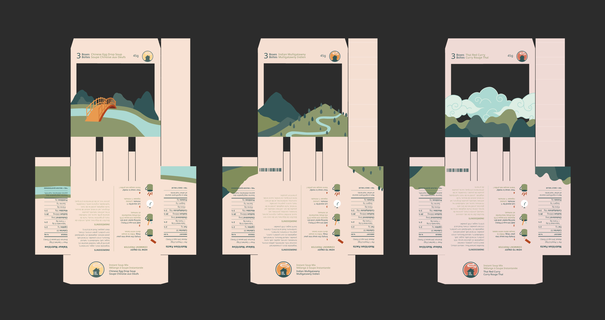
The dieline uses one sheet of material to minimize waste. The solid lines indicate cuts and the dashed lines represent folds.

Dieline

Iterations

Iteration one

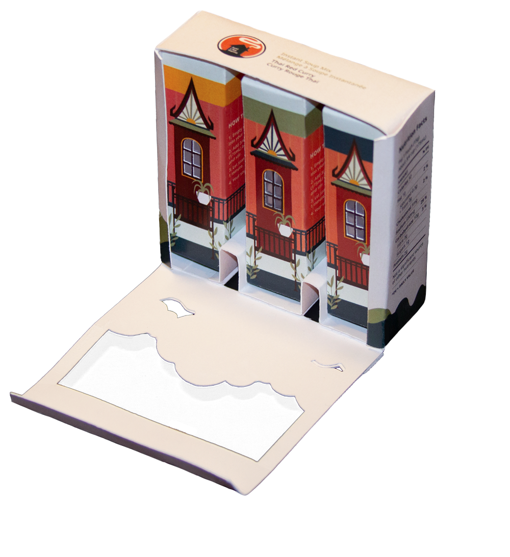
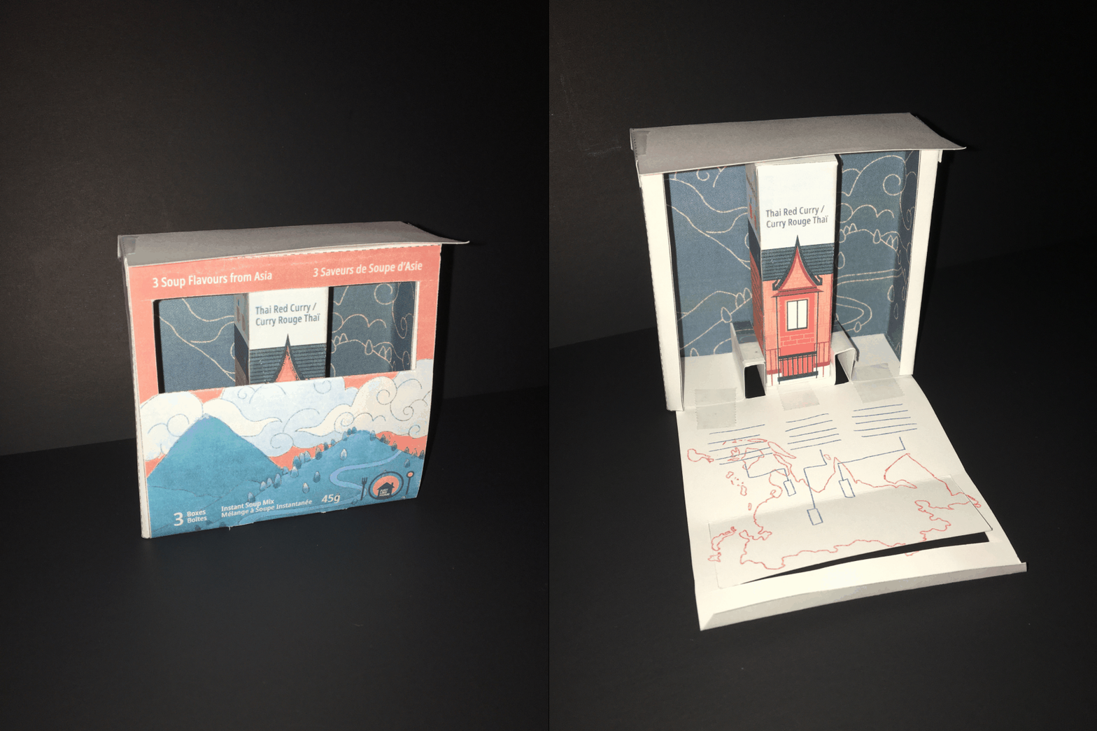
The first version features rough sketches of information placement, and demonstrates how the package is meant to open for revealing the interior containers. The bottom panel is folded to allow sufficient spacing between the smaller packages, and the open window reveals the contents inside.

Iteration 1

Challenges

The hand-drawn illustrations on the front panel were disconnected from the vector style of the interior graphic, and the container itself felt too rigid. Moreover, I had dedicated space for a background illustration and interior infographic, but it felt cluttered and took away from the main components.

Next steps

To address these issues, I planned to redraw the front panel to better coordinate with the interior containers, explore different shapes for the window, and dedicate more empty space to prevent overwhelming consumers.

Iteration two

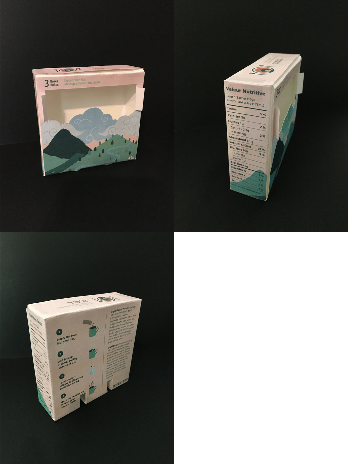
The second iteration has 5 designed panels—in which the front includes an illustration and basic product information, the sides present nutrition facts, the back shows directions and ingredients, and the top features simple branding.

Iteration 2

Challenges

I created side tabs to add improved mechanisms to keep the front panel closed, but they disrupted the aesthetics of the container. The directions and nutrition facts were also not laid out in visually appealing ways.

Next steps

I planned to eliminate the side tabs of the exterior container and instead, add more structure to the front panel by increasing the depth of the top fold. More space surrounding the nutrition and further organization of the directions would improve the appearance of the side and back panels.

Iteration three

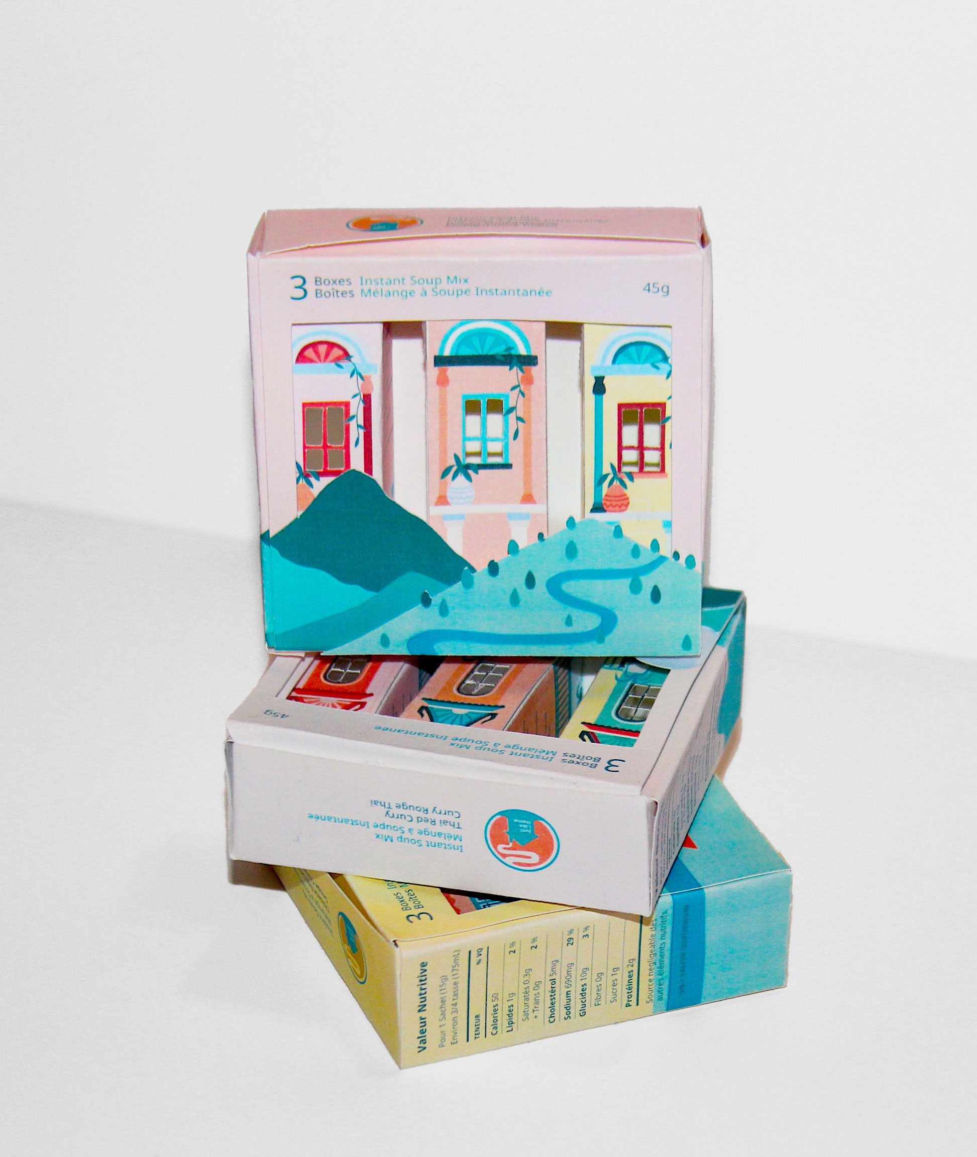
Next, I created three sets of containers to represent flavours from different countries. Each set featured three separate servings, each with their own variation of the same colour scheme. I also began to explore photography and prop options.

Iteration 3: Propped image of the Chinese Egg Drop Soup set
Iteration 3: All 3 sets

Challenges

The colour schemes were light and playful, but did not seem to target the established demographic of young adults. It was also important to demonstrate the purpose of the product through the photoshoot props.

Next steps

I recognized that I had to perform further research to conceptualize a more suitable colour scheme for the packaging. To improve the photos, I had to show the product and use props that would be more reminiscent of soup.

Final iteration

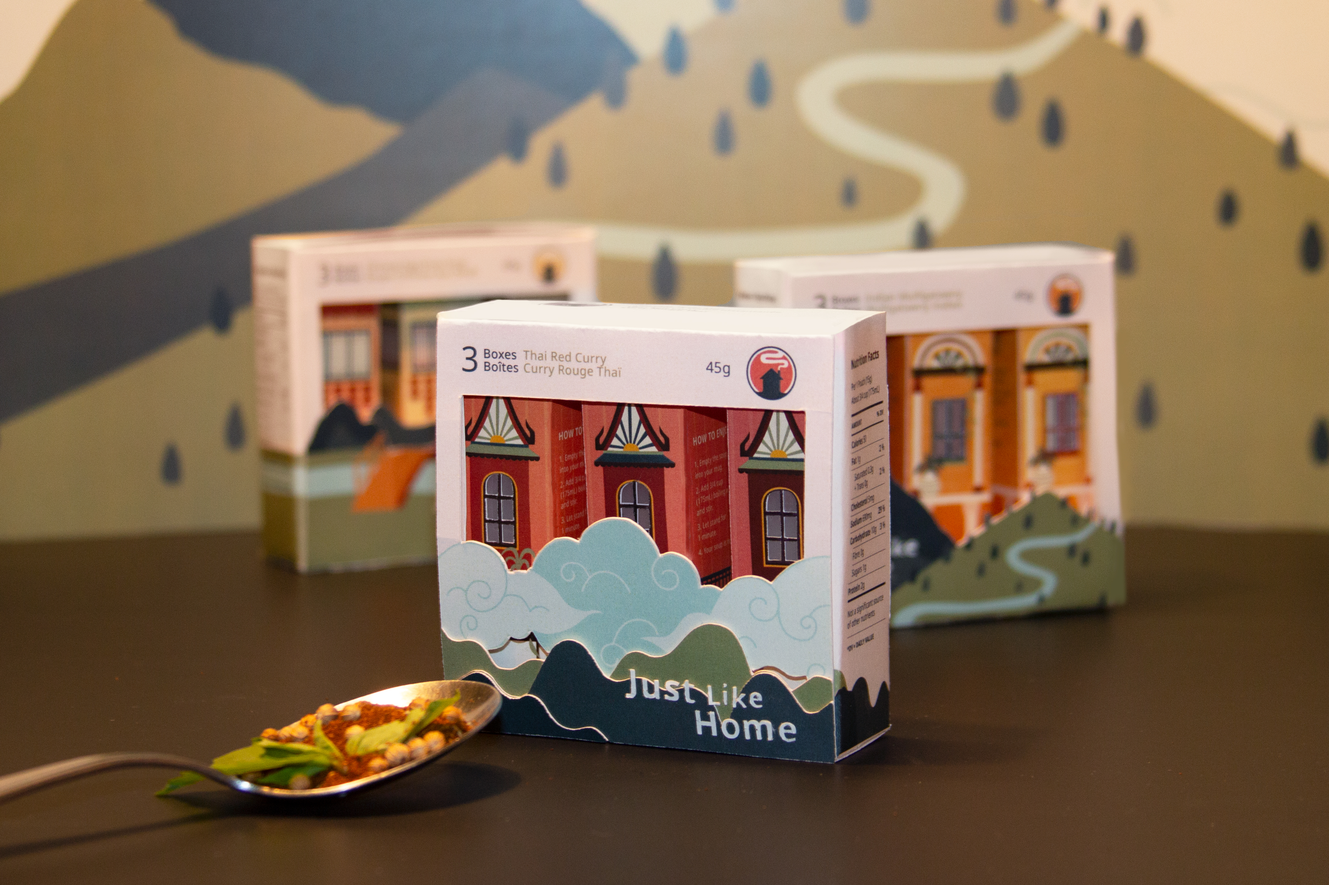
Taking inspiration from the soup flavours, I redesigned the colour scheme to be more fitting of the contents within the packets. I continued to experiment with photography in order to better capture the essence of the product and brand. Below are the final designs of the containers:

3 sets with spoon and soup powder
Final product: exterior containers
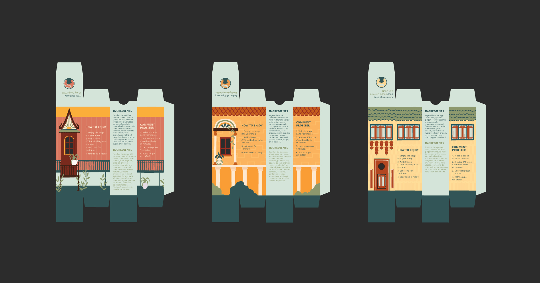
Final product: interior containers

View full process booklet

What I Learned

Printing

Through a screen, I realised that it was impossible to visualise the final result with so many factors to consider such as type, illustration, colour, sizing, and material. Although I only shared 3 major iterations of the product, I had printed and constructed a new variation of the packages nearly every week, which enabled me to find the best solutions.

Photos

Having a photoshoot with the containers emphasised the significance of capturing the packaging in context and demonstrating a wide array of angles. Along with setting up the layouts, I also applied my photo editing abilities to polish up the images.

Propped image of product