Help Centre
Co-op Project

Overview

Redesigning the Customer Service page for the Royal Bank of Canada.

During my Visual Design internship, I worked on refreshing the financial institution's Customer Service page — rebranding it as Help Centre. I collaborated with a team consisting of other Designers, a Product Owner, a Business Analyst, and Developers. Throughout the process, I contributed to the visual exploration, UX design, prototyping, usability testing, and research synthesis.

Type

UX / Visual Design / User Testing

Timeline

Feb - Apr 2023

Tools

Figma / UserTesting.com

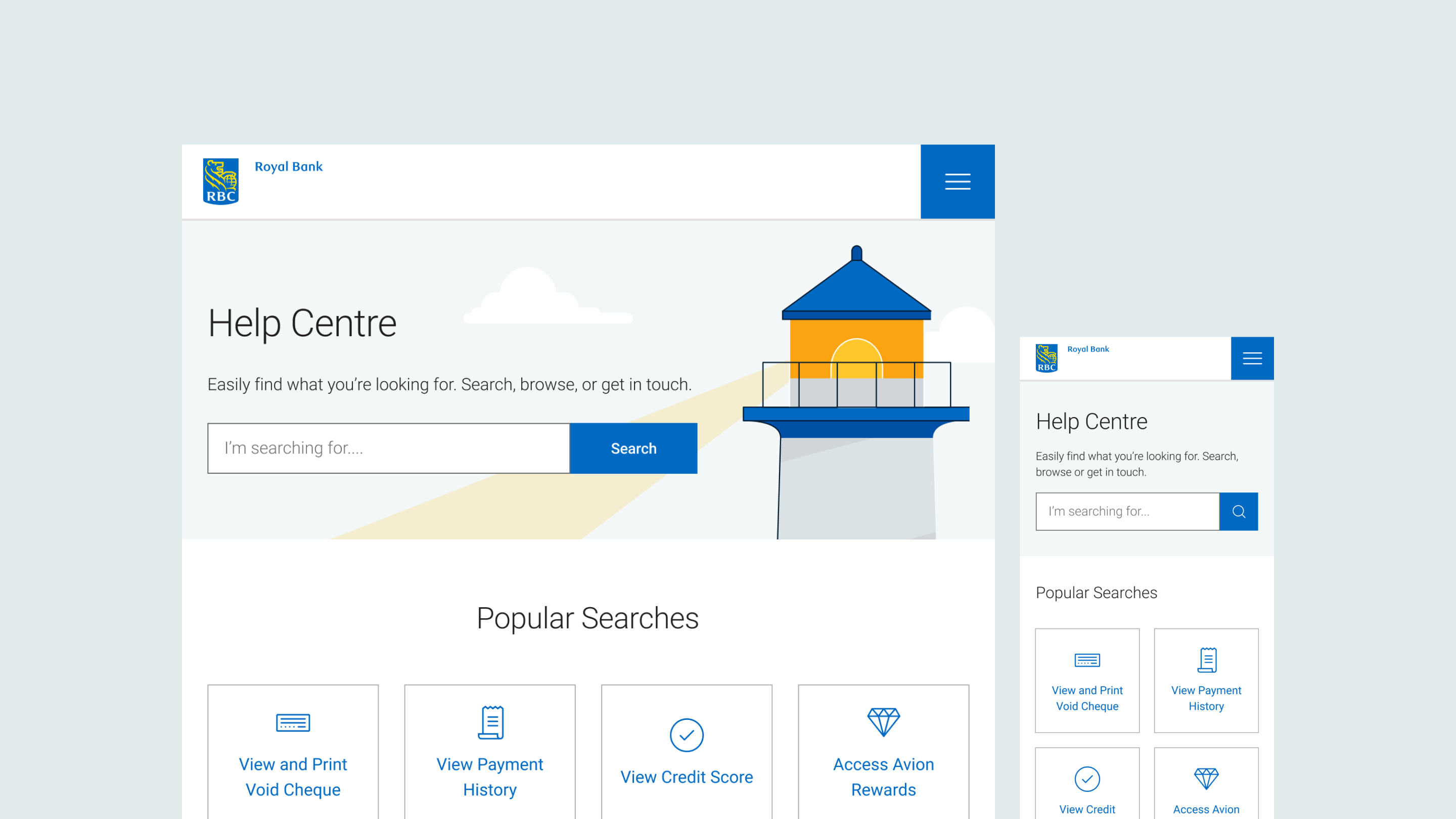
Final Product

Breakpoints

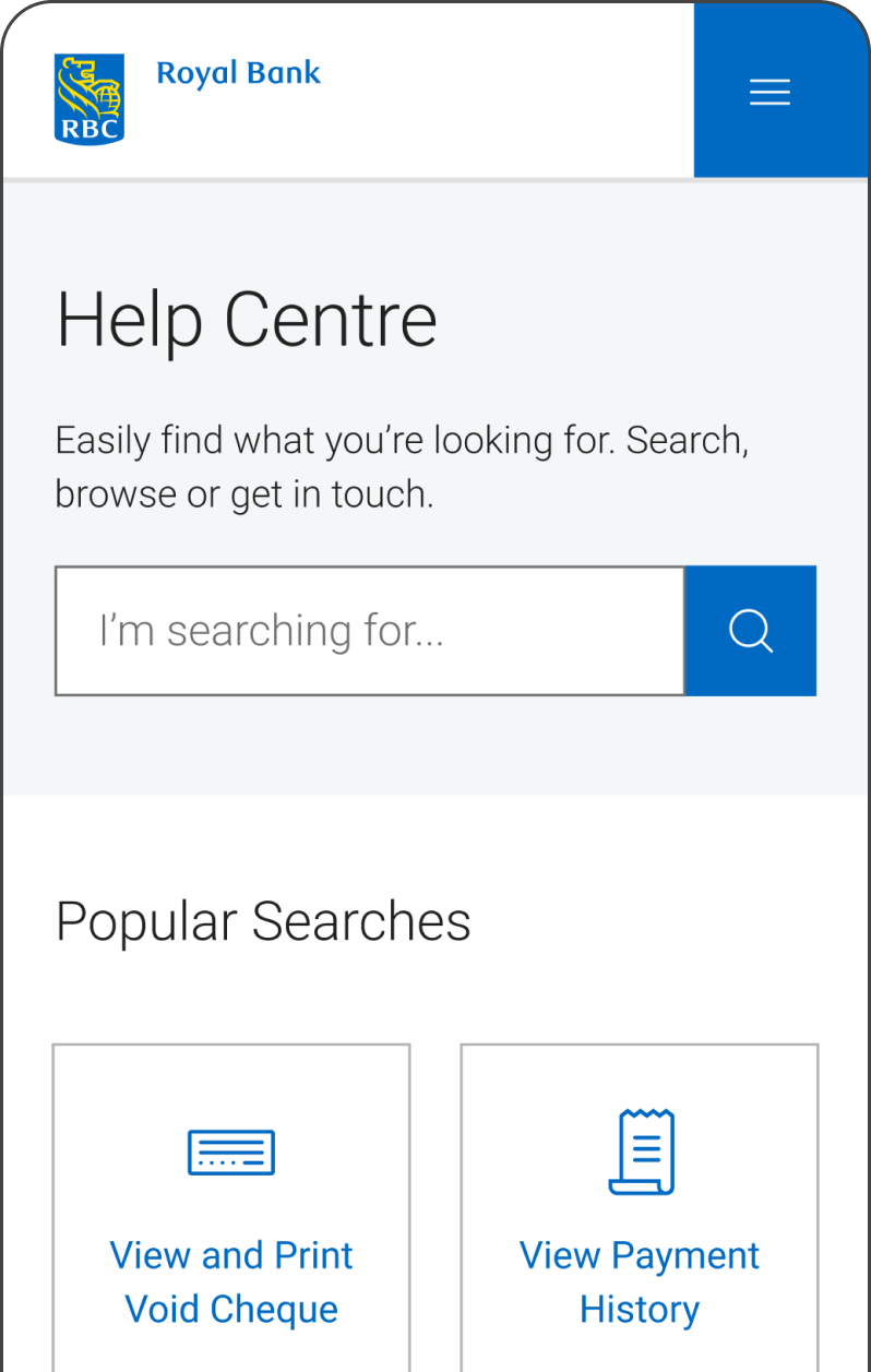
While collaborating with developers, it was crucial to recreate the screens on various breakpoints, including extra small (mobile), medium (tablet), and extra large (desktop). We aimed to maintain consistency with visual hierarchy, while adapting each screen to better suit the device size on which the website is being displayed.

Various breakpoints (XS and tablet screens)

Overview

The Scope

Currently, the Customer service page is not easy to access and does not fulfil the needs of our clients. How might we support our clients and enable them to self-serve and complete/answer their banking needs, without having to visit a branch or contact the call centre? These are the overarching goals of the project:

Customer Service Page

The new page should provide clients with the capability to have a better self-serve experience

New chatbot feature

This function should allow users to ask questions and receive support asynchronously

Usability

The page should be accessible to meet the guidelines of the banks latest standards

Design Process

Competitive Analysis

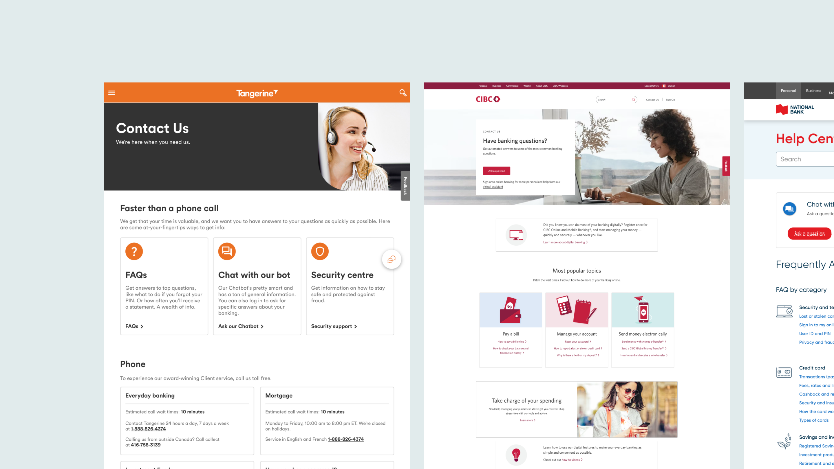
We evaluated the strengths, weaknesses, opportunities, and threats of ten financial institutions. For each website, we made observations regarding the UI, page layout, content, and flow. As our team’s primary focus was on the chatbot function and alleviating our customer service centre, we focused on analyzing the approach to those features.

Snapshot of competitors

Pain Points

With the existing system, the client experiences a variety of pain points when accessing the Customer Service page. To better understand the user, we outlined some of the main ones:

Not wanting to waste time waiting on the phone

Difficulty with finding proper support online

Having a busy schedule can make it hard to find time

Wireframes

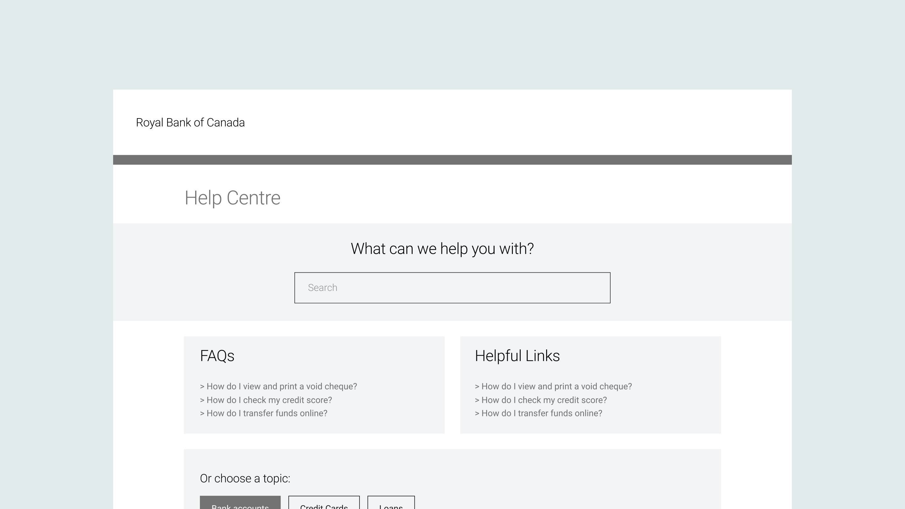
To determine the ideal hierarchy of information, our team created wireframes to explore various methods of laying out the webpage. We aimed to ensure a balance between providing an informative experience, without overloading the page with content. We had access to user metrics and most popular search terms, which informed us about what clients were searching for. I also rationalized for the ‘Contact Us’ section to be positioned at the bottom of the webpage to encourage clients to self-serve before getting in touch with customer service.
Wireframes

User Testing

Objective

We conducted user testing with banking clients to gain insight into areas of improvement and ensure that our design offered an intuitive user experience. The testing was performed to validate our designs and highlight any potential adjustments that needed to be made.

Testing Process

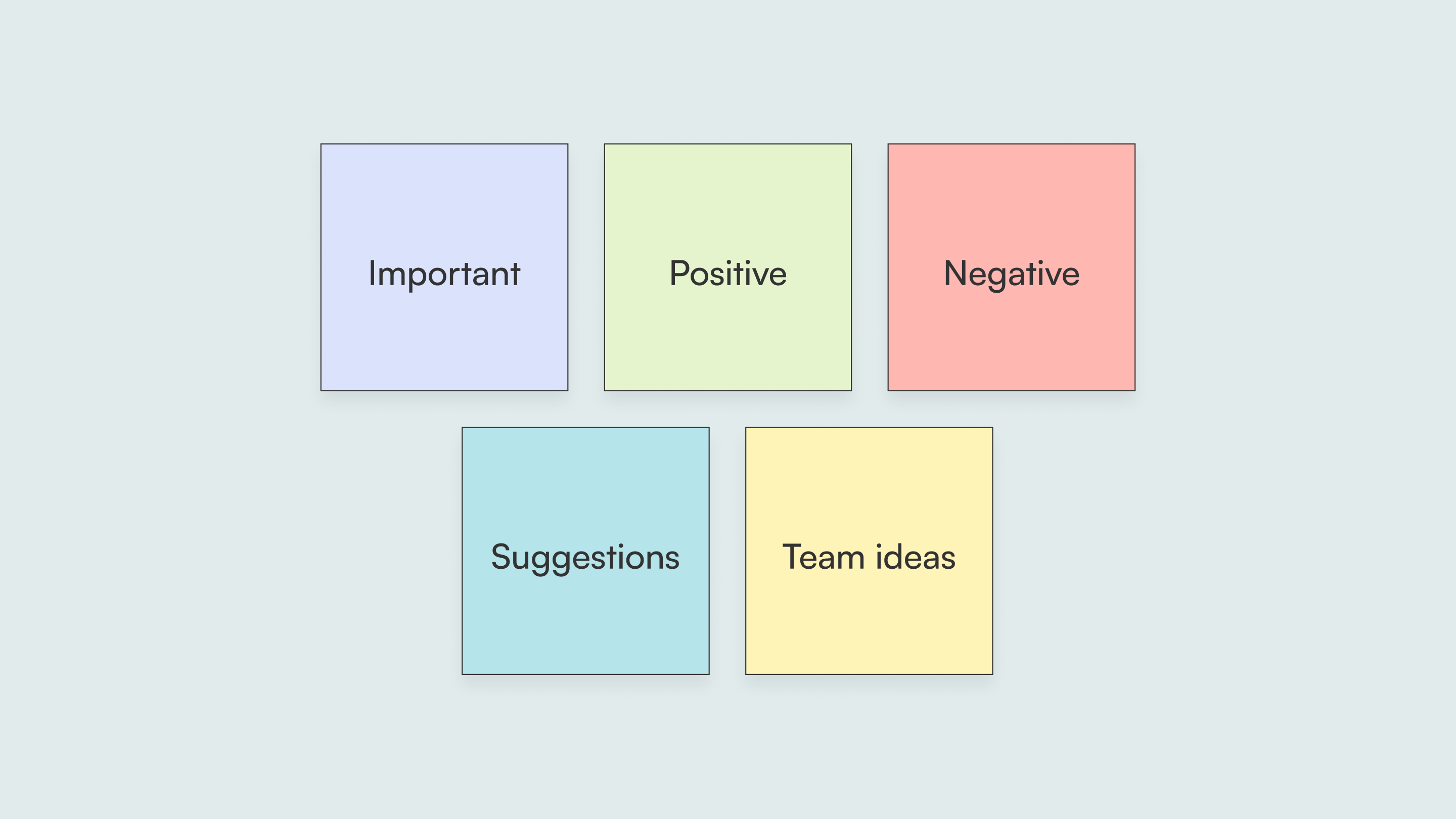
The Design Researcher prepared a research outline and a series of questions to introduce the client to the Help Centre page and prompt further thinking. We hosted ten 30-minute sessions, and I was fortunate to have the opportunity to act as an observer, note-taker, and a moderator. Following the sessions, we colour-coded our insights to organize them into 5 categories: important, positive, negative, suggestions, and team ideas.

Colour-coded sticky notes

Takeaways

From the usability testing sessions, we gained a number of insights that supported us with better understanding the client. These were some of the major ones, and "How Might We?" questions we considered when moving forward.

HMW further clarify all of the the section headings?

HMW create greater visual interest throughout the page?

HMW ensure that clients are finding what they need?

Final Steps

Refining the Design

To address the HMW questions developed in response to the usability testing, we outlined a few of our next steps. We wanted to update the headings to provide further clarity and rearrange the categories to support clients with locating the information they are seeking.

Working with Developers

Our team of designers produced pixel-perfect flows using the Financial Institution's component library and typography styles, along with Figma’s auto-layout function. We also considered how illustrations and text would adapt with various breakpoints.

Moving forward

To finalize the project, we would have met with the accessibility team to ensure that the design follows accessibility guidelines through the development of the product. We would also complete internal testing to ensure there are no bugs and that the functionality works as planned. Once the webpage is launched, our team will measure impact by tracking metrics to evaluate whether our overarching goals are being met, and strategize as necessary.

Return to Homepage