Gyve
Mobile app

About

By streamlining the donation process, encouraging the act of gifting, and empowering charities to share their needs, it’s easy to make an impact with Gyve.

Type

Prototyping / Branding

Timeline

October - December 2022 (8 weeks)

Tools

Figma

Gyve hero image

Product Overview

The Scope

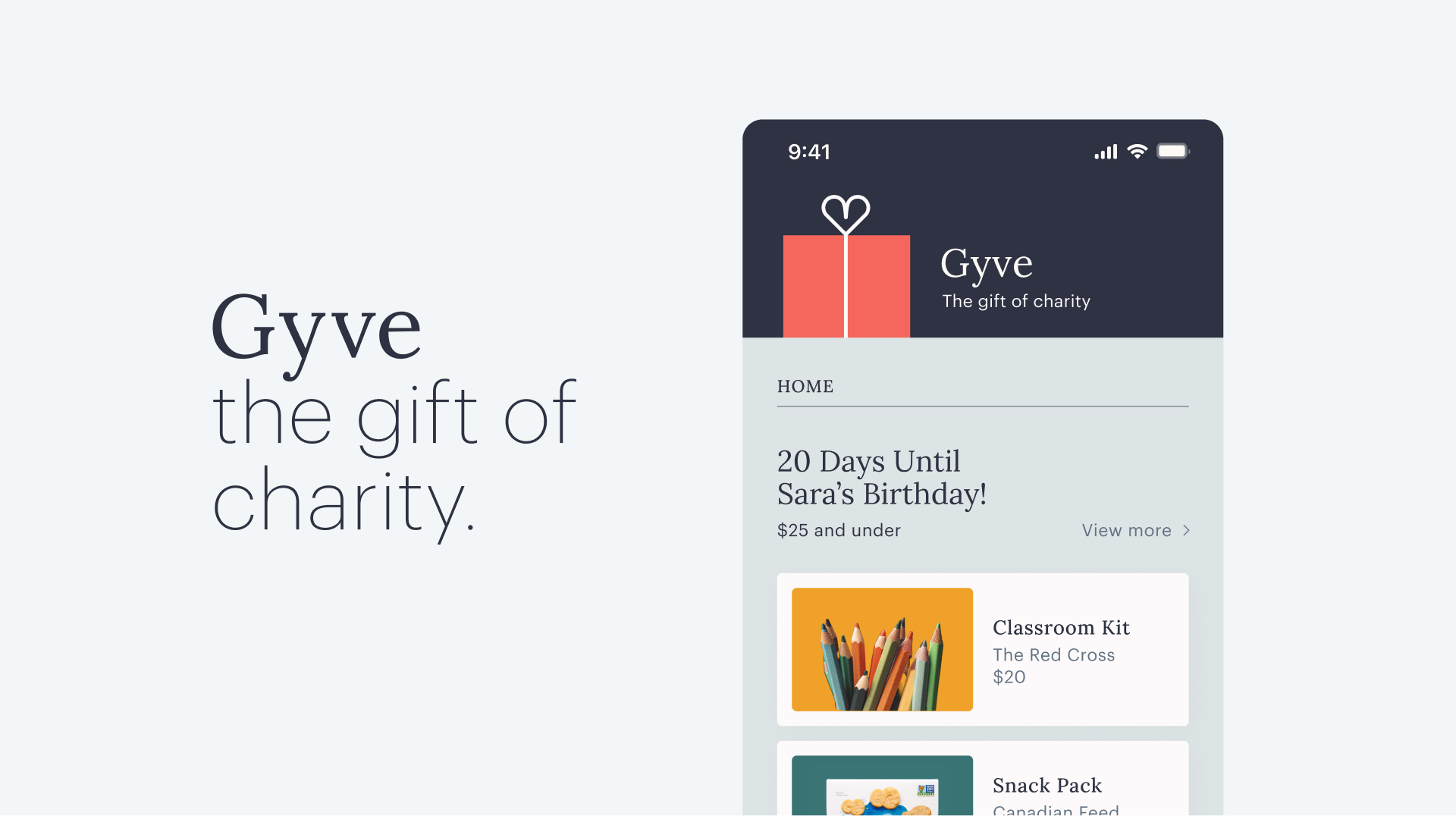
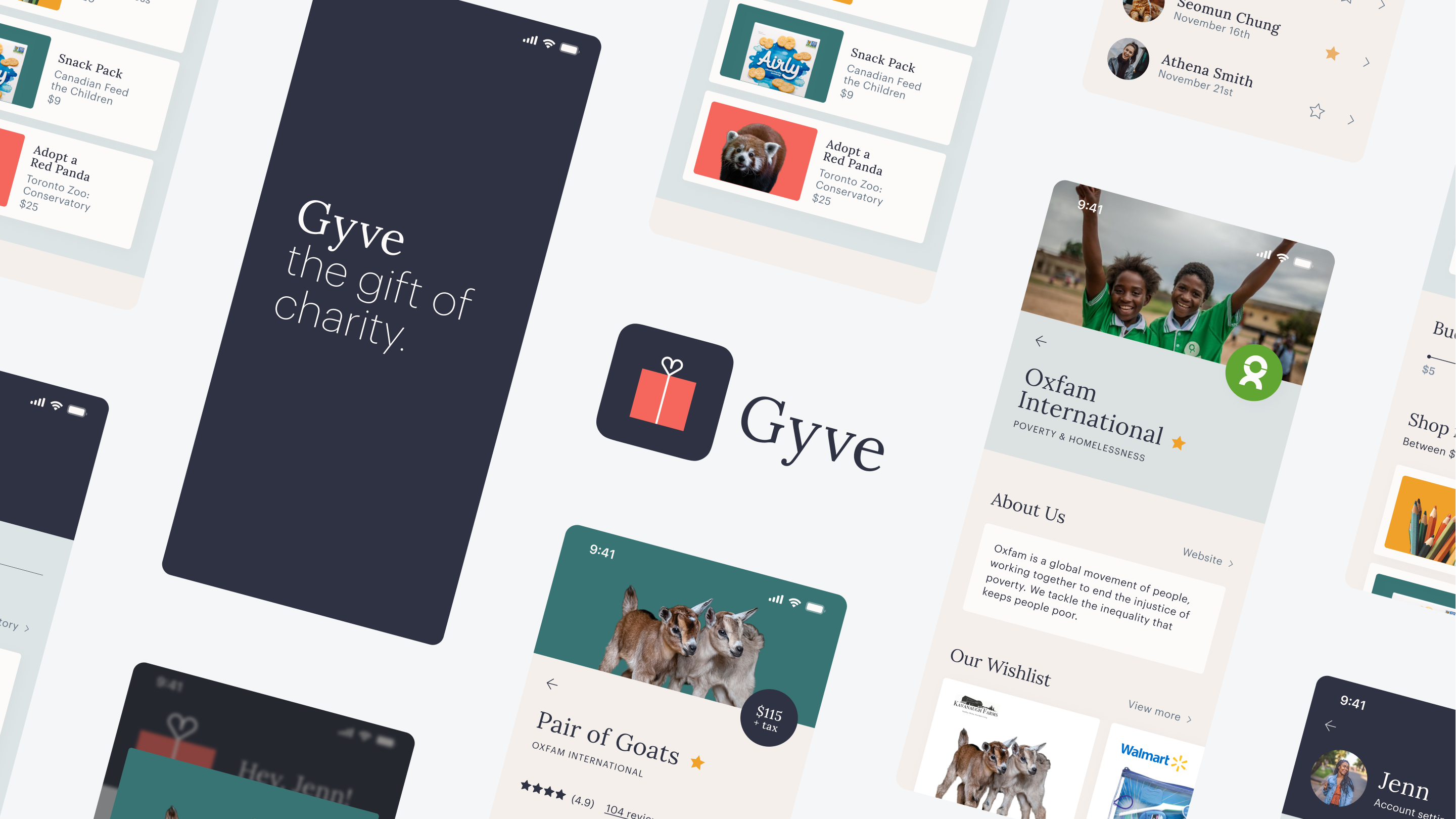
Gyve is a mobile application that encourages individuals to purchase charitable items as gifts. Honesty and transparency are highly valued factors when supporting charities, and most individuals give more if they had greater insight into the impact of their money. Gyve aims to address these concerns by empowering users to choose how they allocate their funds. Furthermore, the app encourages people to contribute more often by donating on behalf of friends on birthdays and special occasions.
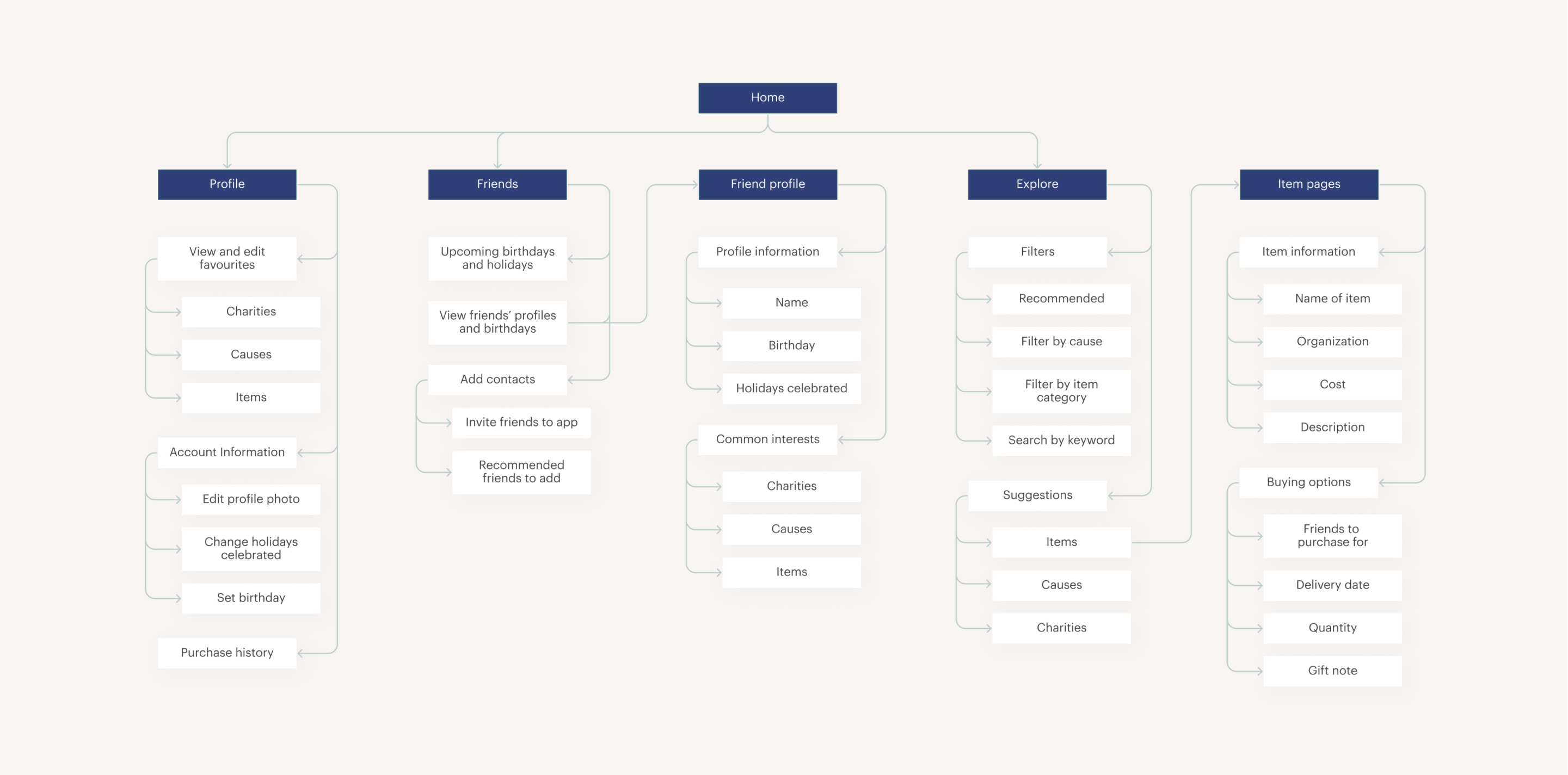
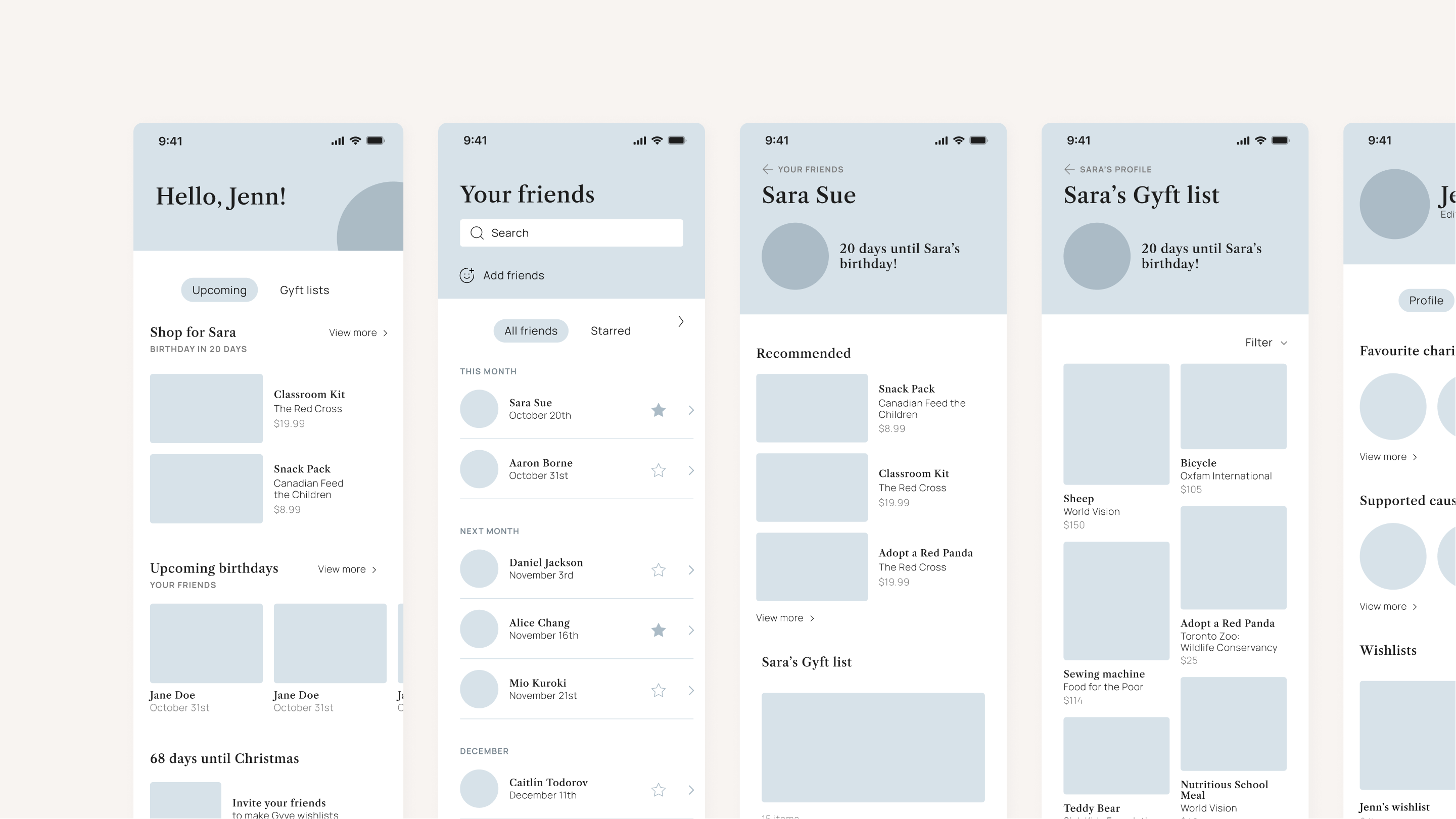
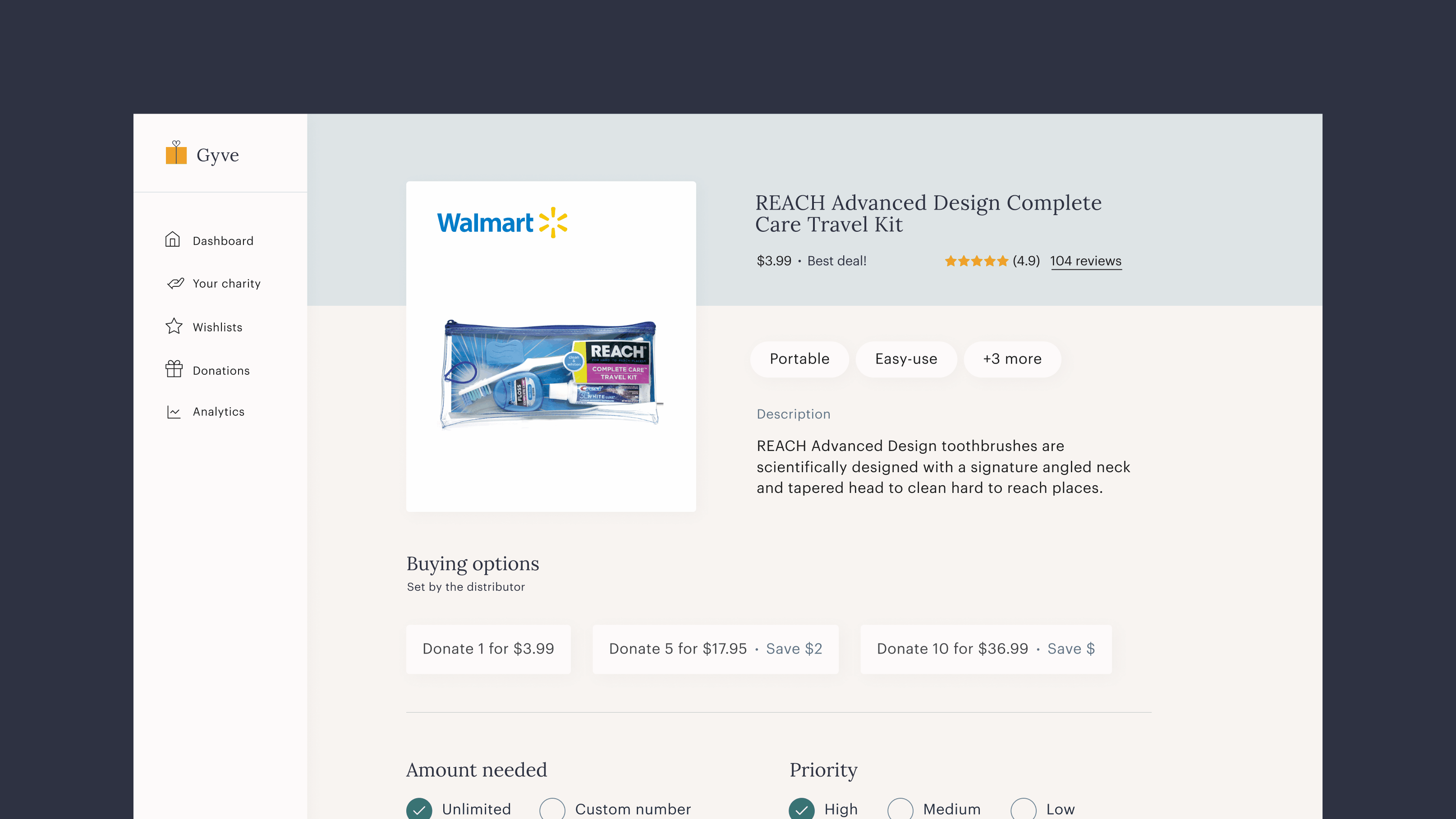
How Does Gyve Work?

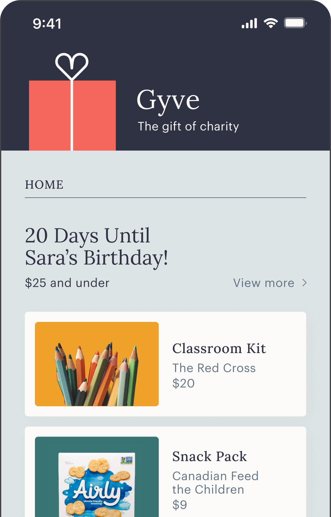
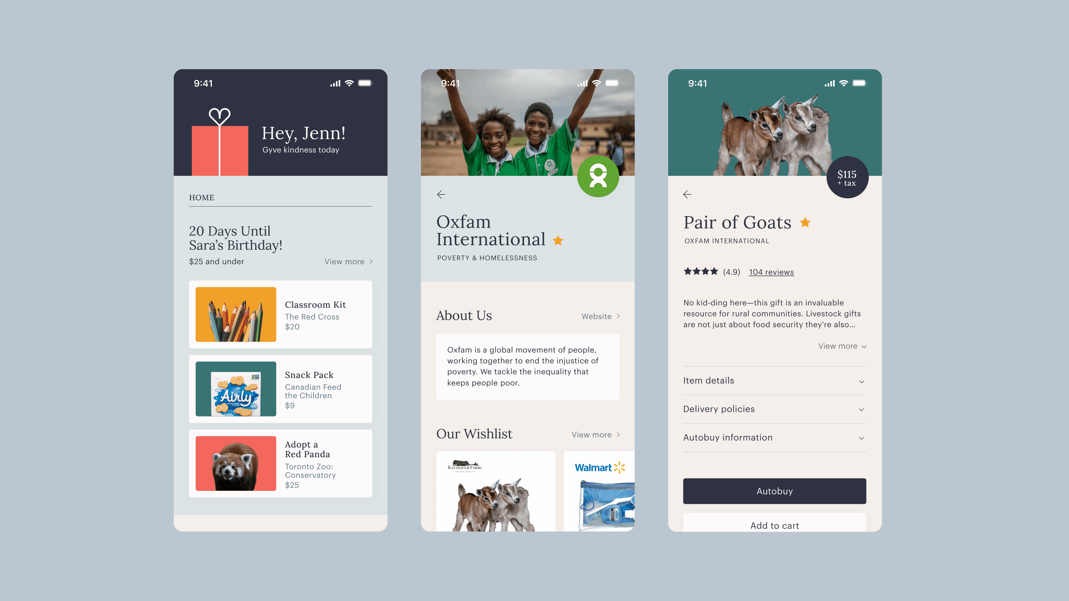
Individuals can explore various causes and charities to customize their interests and tailor their profiles. Each verified charity can build a wishlist with the items that they are in need of, which are then presented to the user. While shopping for a friend, the app generates gift recommendations based on multiple factors, including common interests and price range. After finding the perfect present, users can schedule purchases with autobuy and automatically receive cashback when prices decrease.

Three screens A gif of itinerary suggestions

The Approach

With this project, it was essential to consider how to bridge the gap between our wants and our actions. To encourage individuals to donate more frequently, I realized that it was essential to increase transparency, simplicity, and connectedness. The app allows users to decide how they contribute their money, leverages automation to deliver a straightforward experience, and connects individuals with their friends and the greater community. It also presents the opportunity to highlight local shops, partner with businesses, and engage with charities that require our support.

Shuffling taglines

Process

Competitive Analysis

I was initially tasked with incorporating automation into a gift-giving mobile application, and I performed competitive analyses to compare various platforms. The apps I explored allowed users to input their birthdays and create wish lists, but I but found numerous existing products that fulfilled the same purpose. Thus, I decided to pivot and tackle an underserved space to produce a mobile application dedicated to donating charitable gifts.

Competitive analysis

Opportunities

Performing research enabled me to discover and outline numerous opportunities when creating the app, including the abilities to:

Emphasize the social aspect of gift-giving by connecting users with their social circles

Provide tailored recommendations based on common interests

Encourage purchasing gifts through regular reminders for birthdays and holidays

Information Architecture

I categorized features to map out the content and flows that would be included in the mobile application. The homepage would connect to the three other sections: the user’s profile, an overview of their friends, as well as a page to explore causes and charities. This selection was curated to emphasize connectivity and discovery, providing users with opportunities to tailor their interests and stay up-to-date with their social circles.

Information architecture

Wireframes

To explore hierarchy, I created rough wireframes and layout options for the different pages. By building the app without the visual design and imagery, I was able to focus on the user experience and flow of the mobile application.

Wireframes

Visual Identity

Logo

I developing a visual identity that was lively and represented the experience of the product. The logo is representative of the main aspects of the mobile application, combining charity and care with a present to symbolize giving.

Logo (combination of a heart and a gift)

Colours & Typography

In the colour scheme, the blues symbolize stability and trustworthiness, while the highlight colours are friendly and fun to appeal to a younger audience. I ensured that the colours were adopted in a high contrast manner, so that accessibility was a priority. I also used typefaces that were highly legible, and balanced a serif with a sans serif to produce variety. Overall, the colours and typography add visual interest, while enforcing the engagement aspect of the mobile application.

Colours and typography

Web App

Overview

In addition to the mobile application, I also designed a web app interface for charities to customize their profiles and wish lists. This product highlights the features that allow for recommendations and automation. The charities are also able to set the parameters to fit their needs and receive tailored support from users.

Web app screens

Takeaways

The Audience

Creating the mobile application for individuals and the web app for charities encouraged me to consider the flows from different perspectives. For curation, I explored methods of empowering the user to customize their experience and leveraged automation to achieve this.

Prioritization

While designing a zero-to-one product, it was essential to narrow in on the necessary elements as first priority. Creating an information architecture and wireframes supported me with focusing on the most important pages and flows. As I translated them into high-fidelity wireframes, I could be more detailed with the elements on each page. This encouraged me to ensure that I was always considering the content on each page before refinement.

Web app screens

Return to Homepage