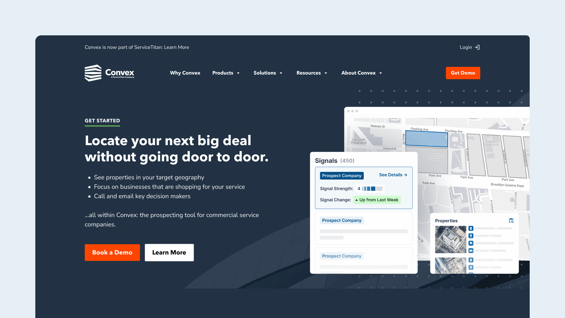
Component Library
I supported the Design Lead with creating a comprehensive library of components, ensuring they were intuitive for designers and developers. He began by laying out a foundation of desktop components and page templates. I then added mobile versions of each component, created additions such as the header and footer, and reorganized the Figma file.
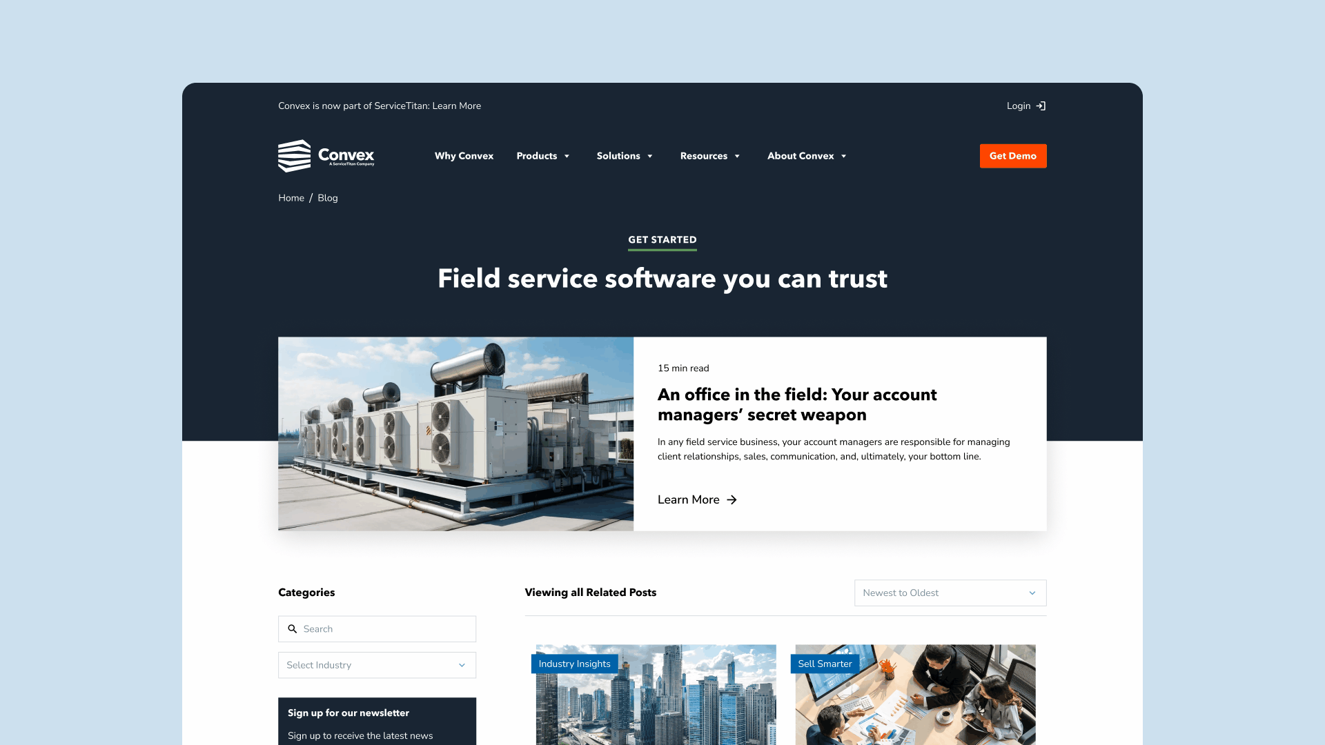
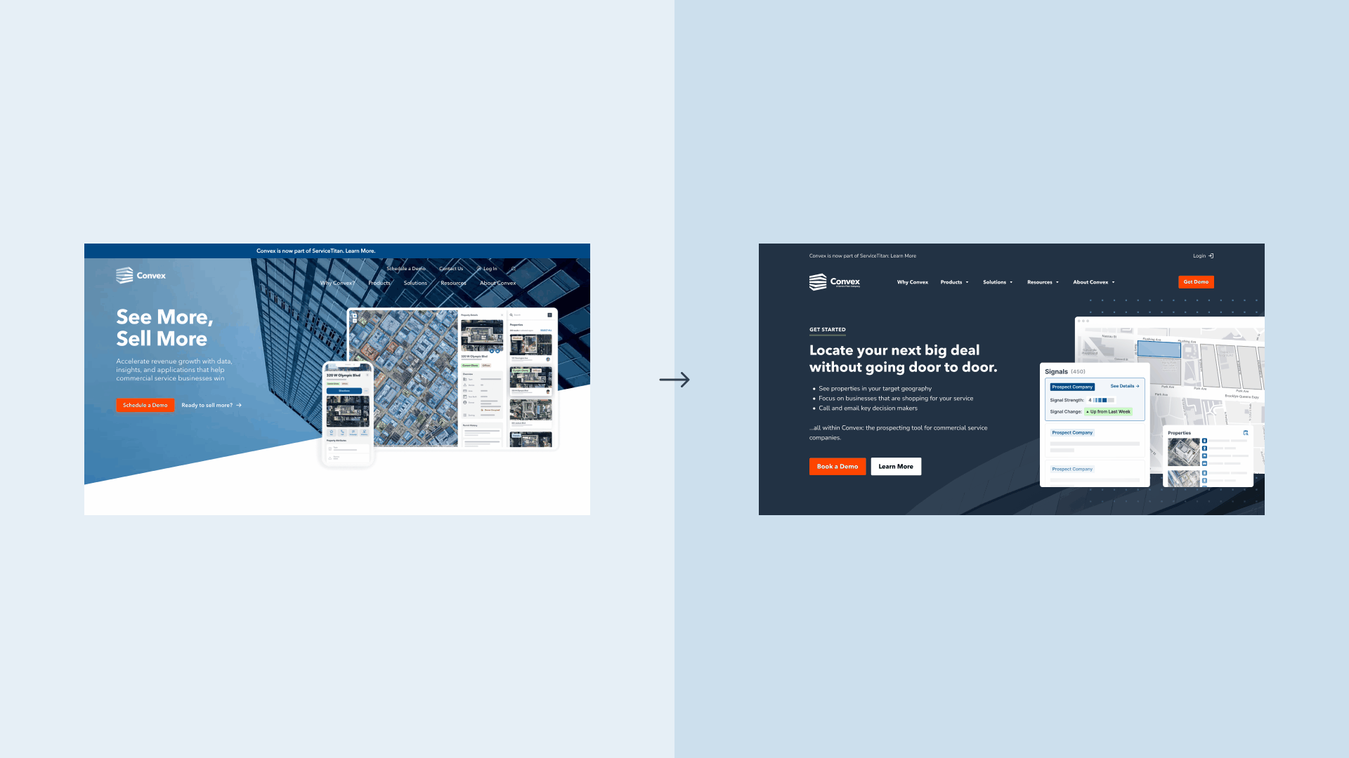
Content Migration
We then established how we would translate current components into new layouts, which included bringing over existing copy and assets to complete polished mock-ups of the website’s pages. For a few select instances, such as the homepage and industry pages, we collaborated with agencies, stakeholders, and our in-house copywriter to refresh the structure and content.
Interaction States
Another integral aspect of the design process was considering how the user would interact with the website’s components. I created multiple variants for foundational elements including buttons, input fields, and selection drop-downs. I also designed and laid out various states for the header navigation.
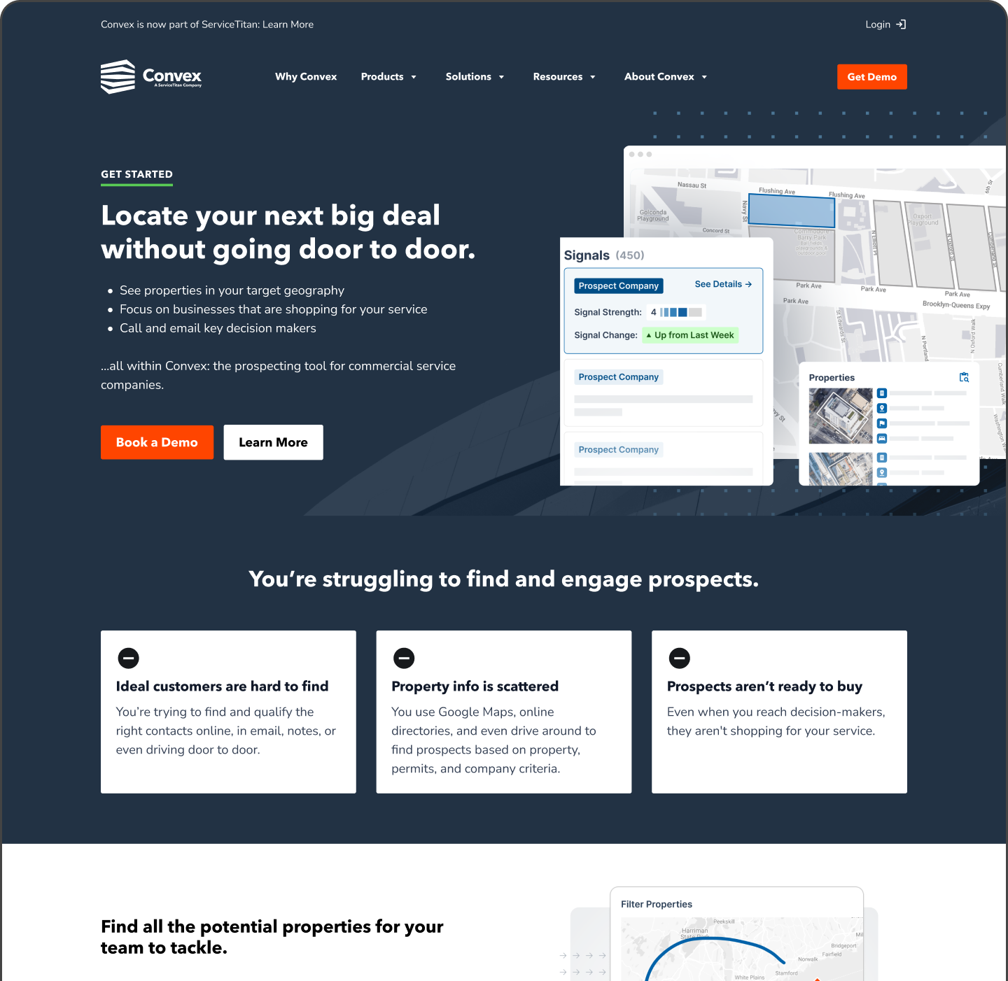
Front-End Reviews
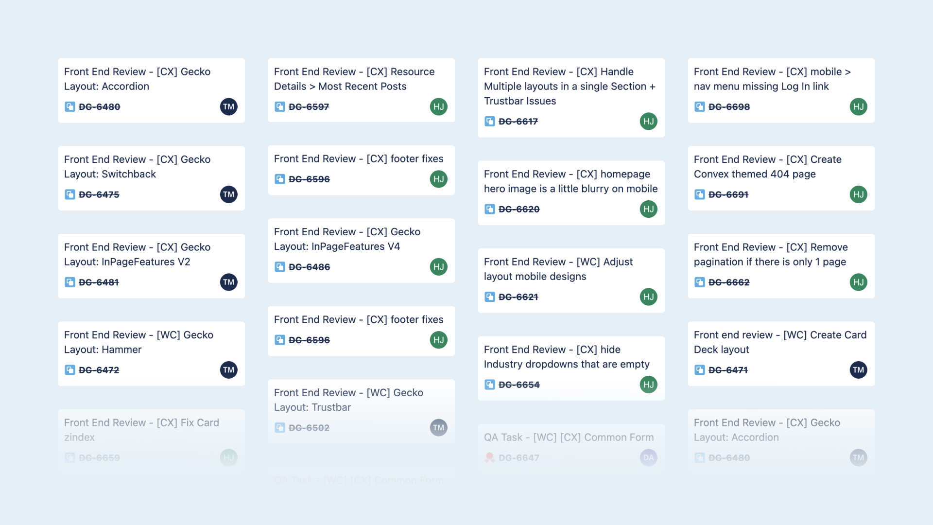
Referencing our newly created design system, the developers brought the website to life by translating our visual work to code. During this stage, I led front-end reviews to ensure the published components were accurate to the Figma file, noting factors such as typography, spacing, responsiveness, and interactivity. I also responded to dev inquiries, documented any design issues, and collaborated with other team members to polish the website.