Align
Mobile app

About

An automated social scheduling app that connects friends with local businesses.

Type

Prototyping / Branding

Timeline

September 2022 (4 weeks)

Tools

Figma

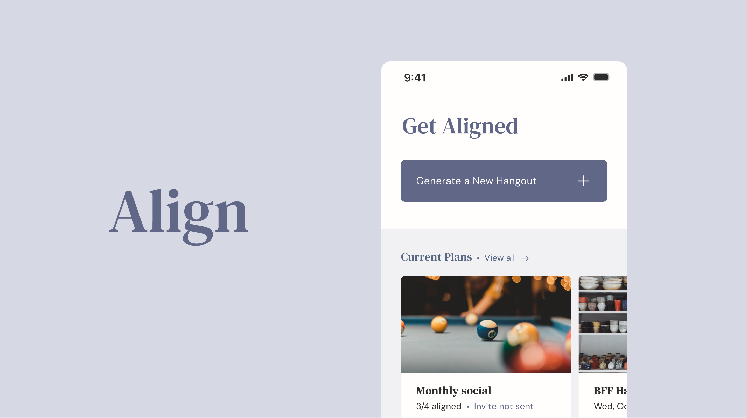
Align hero image

Product Overview

The Scope

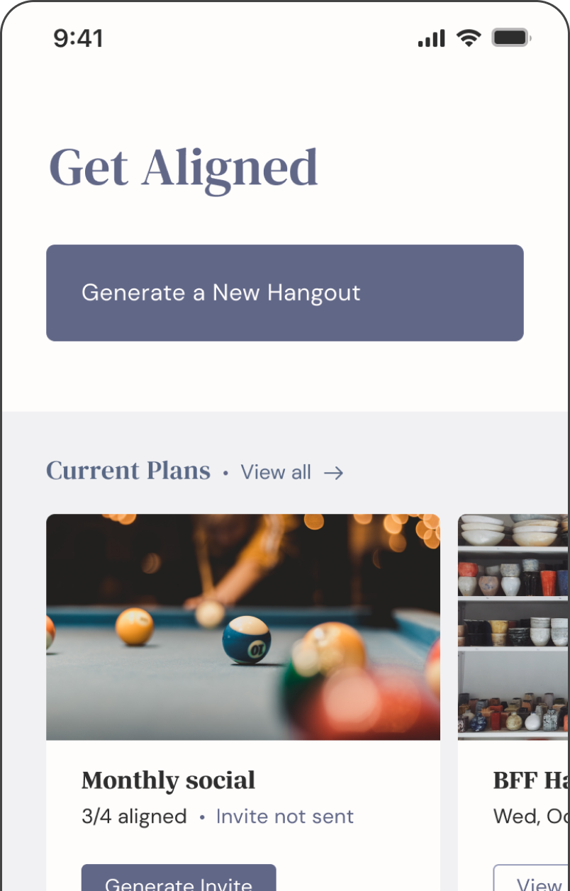
By leveraging artificial intelligence, Align is a mobile app that schedules social time and recommends local activities according to everyone’s calendars and preferences. While taking into account each person’s needs, creating plans with friends can be a process that is challenging and time-consuming. It is essential to consider everyone’s availability, tastes, and location—while ensuring that all participants are constantly informed about plans. The app simplifies this process by generating suitable recommendations to establish alignment across a group of friends.

How does Align work?

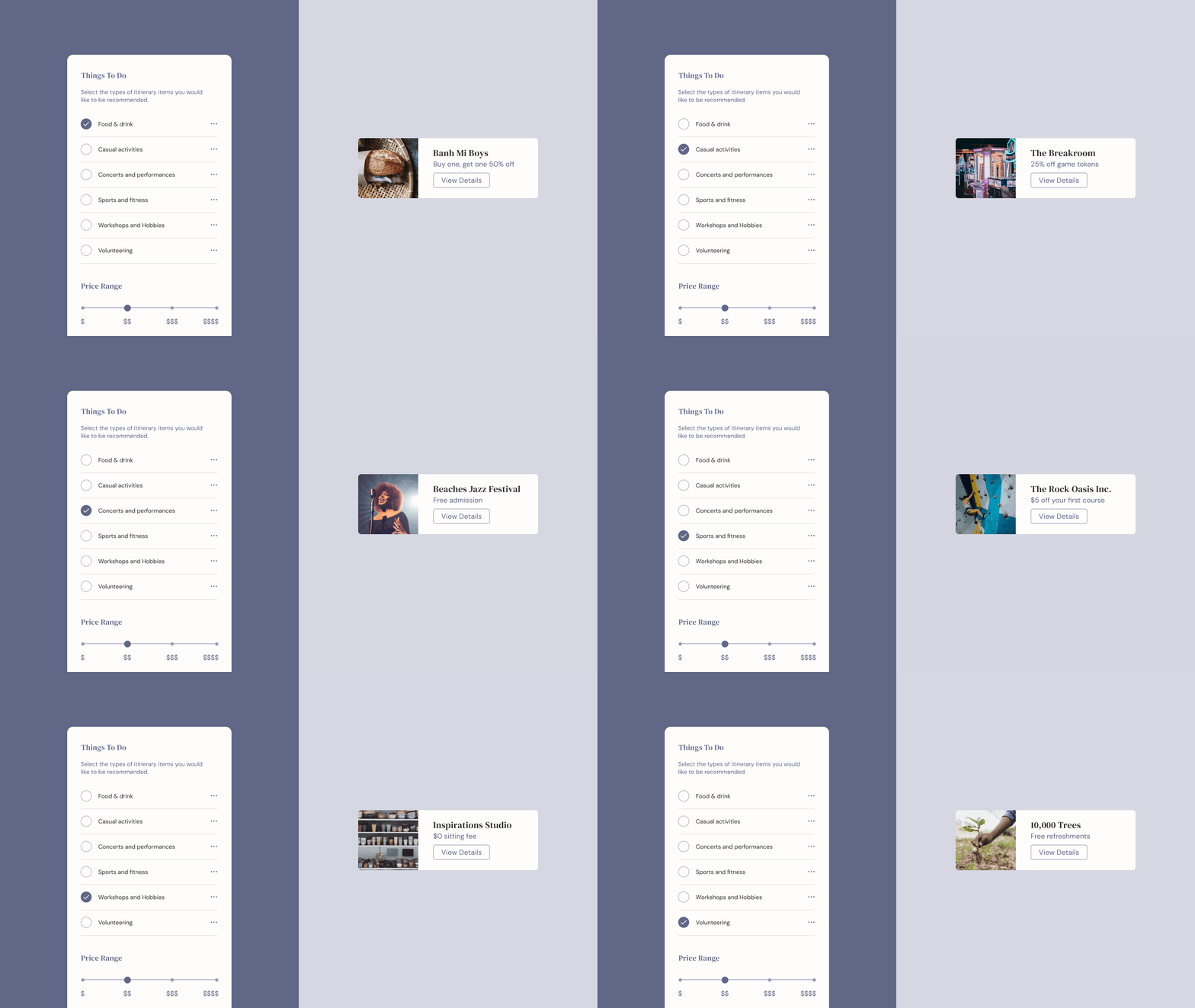
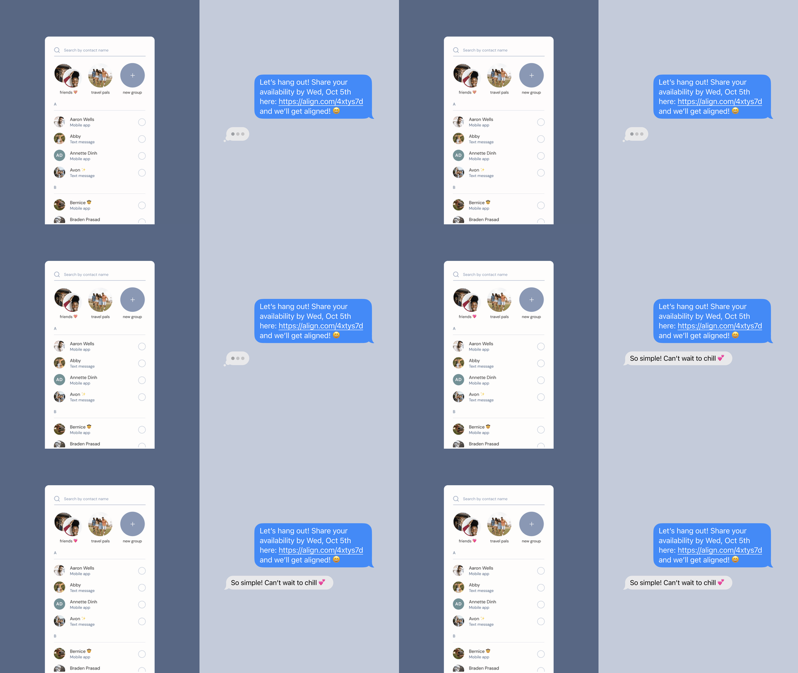
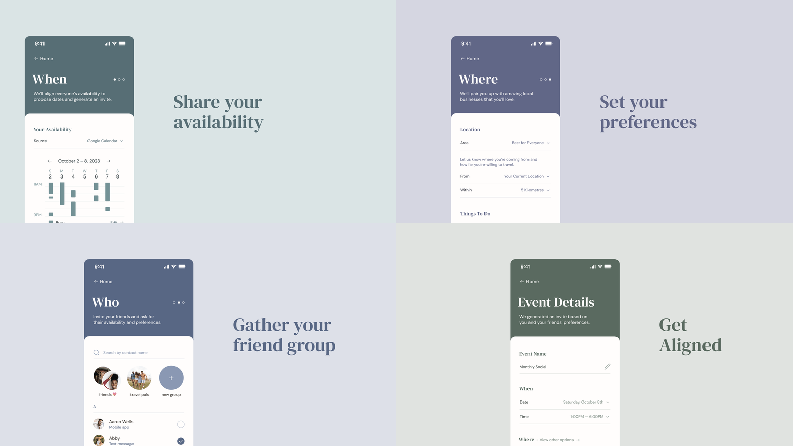
The individual who sends out the invitation begins by specifying the frequency of events, the times to consider, and the participants to add. Through automation, the app can integrate with each attendee’s pre-existing calendars, including Google Calendar and iCal, for their most current availabilities. To ensure that everyone is receiving all the updates, the user can also send out invitations and reminders via in-app notifications and text messages. After generating the itinerary, the app allows participants to customize the event to better fit their preferences.

Activity screen

The Approach

Align encourages users to socialize with friends and discover the offerings of their neighbourhoods, without requiring the time and effort it typically takes to organize plans. To achieve this, the app partners with local businesses to present specialized discounts, highlight up-and-coming shops, and encourage reviews. By uniting individuals with their friends and the world around them, Align promotes social connectivity and local exploration.
Availability screen

Process

Competitive Analysis

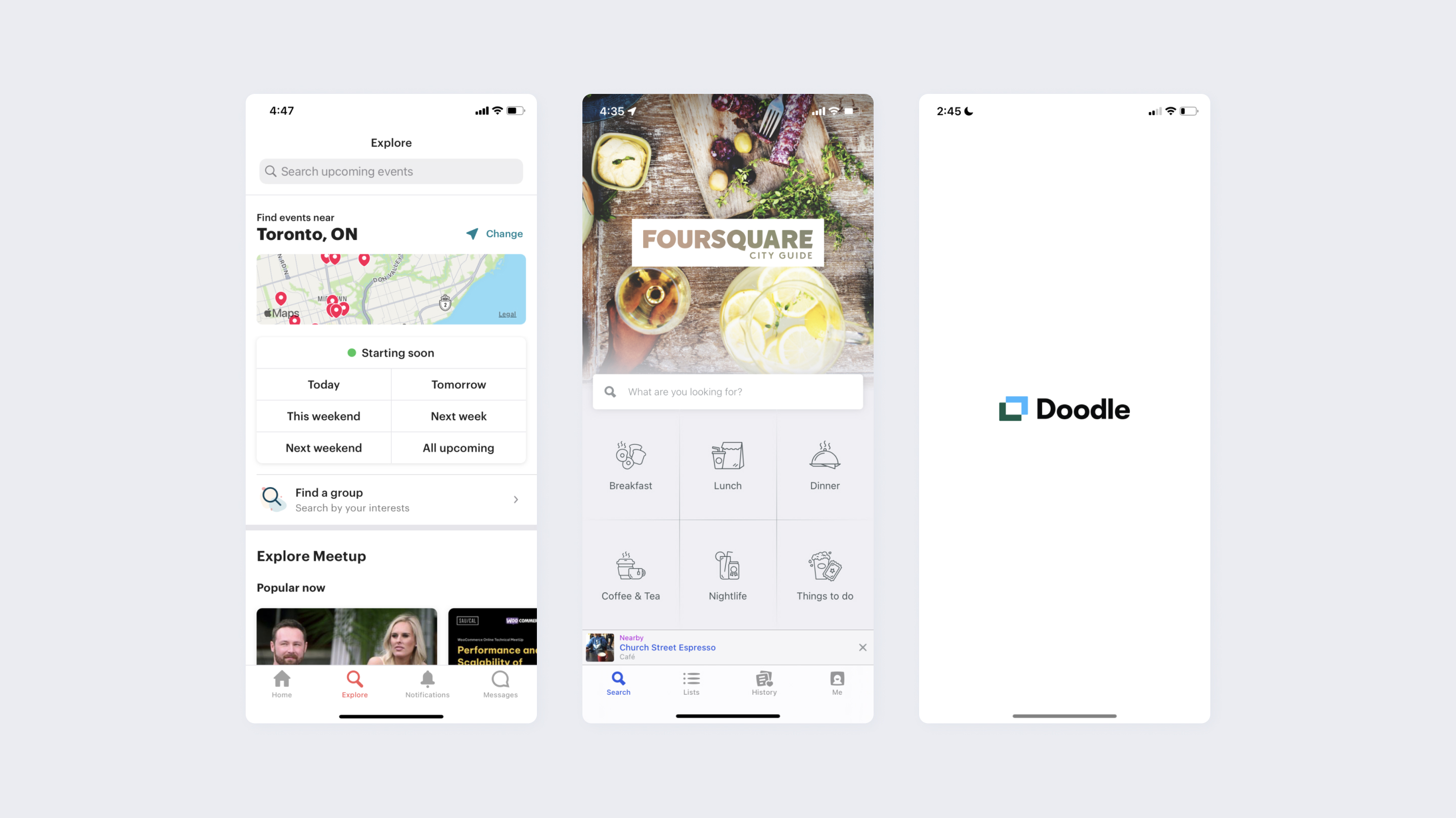
To gain a better understanding of the problem space, I evaluated relevant websites and mobile applications. Most of the products were either solely focused on scheduling or finding local activities, but none of them blended the two aspects into a single experience. Furthermore, many of the apps for discovering local events and businesses provided a database, rather than customized recommendations.

Competitive analysis

Outlining Opportunities

Performing research enabled me to discover and outline numerous opportunities when creating the app, including the abilities to:

Combine automated social scheduling with generating custom itineraries

Offer exclusive deals and promotions in collaboration with local businesses

Provide a curated experience based on the user and their friend’s preferences

User Flow

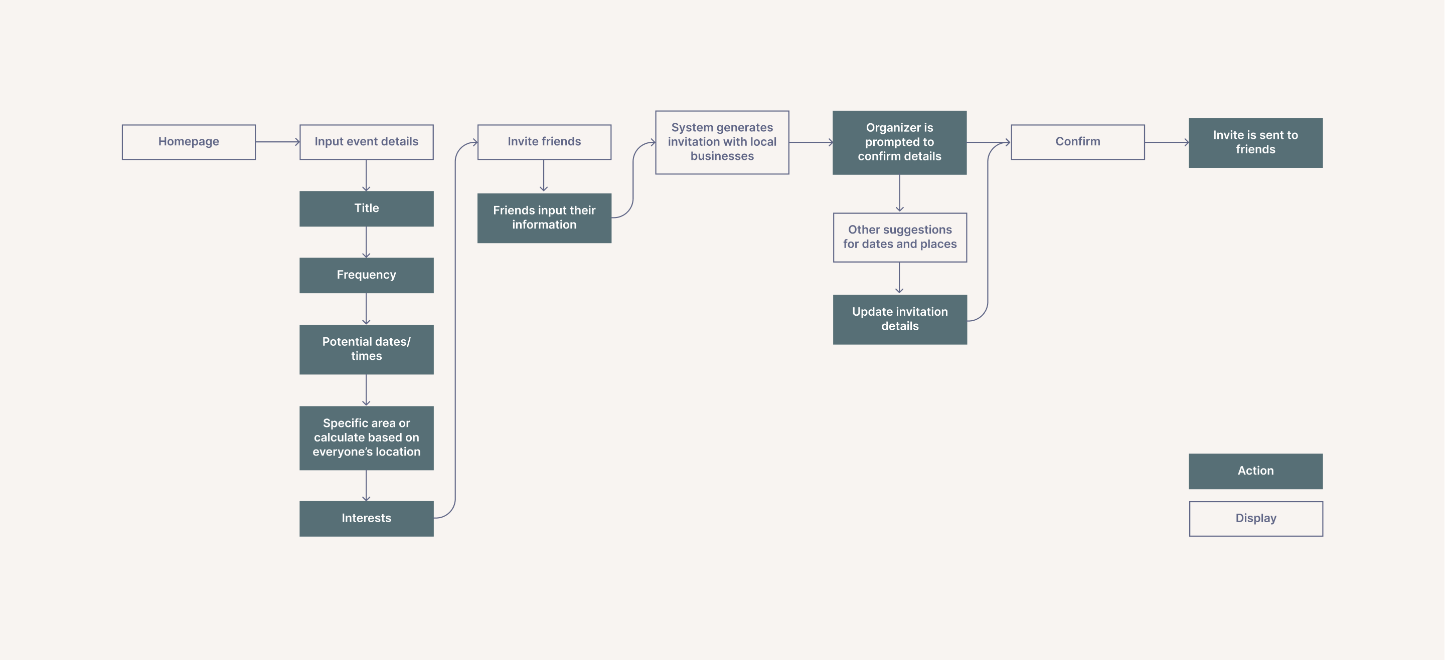
Mapping out a comprehensive user flow encouraged me to consider the mobile application’s content and user interactions. In particular, it prompted me to think about the variety of information that would need to be inputted by the user and considered when providing recommendations.

User flow

Wireframes

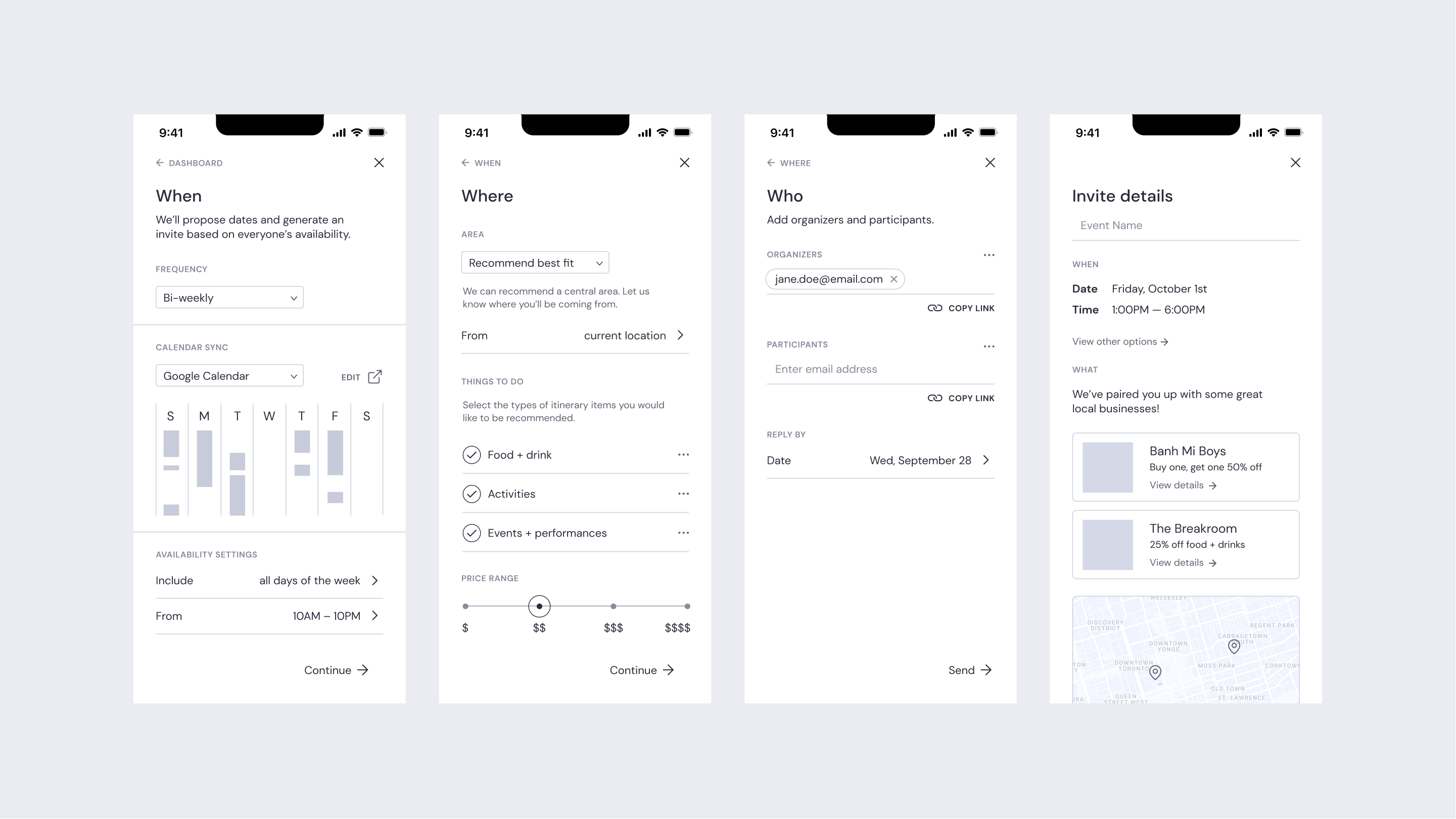
By creating wireframes, I was able to visually lay out the content in an organized and digestible manner. It allowed me to categorize the input information, and I entitled them “When”, “Where”, and “Who” to provide simple descriptions of the separate sections.

Wireframes

Key Takeaways

Balance

It was essential to capture enough information from the user to generate recommendations, while ensuring a smooth and comprehensive experience. Designing with this in mind, I aimed to ensure that the elements and interactions were simple without compromising the outcome of the flow.

Content Design

This project reinforced the significance of content design and its impact on the user experience. The layout of the app was heavily influenced by the written content on each page, encouraging me to consider the intertwinement of all factors from concept ideation to the final product.

A gif of four screens

Return to Homepage