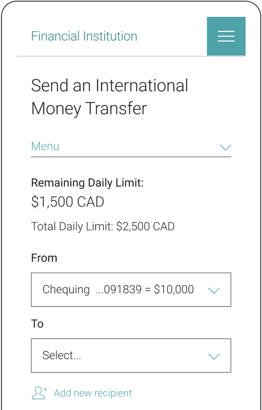
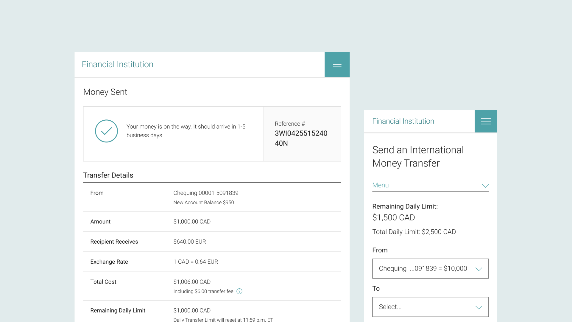
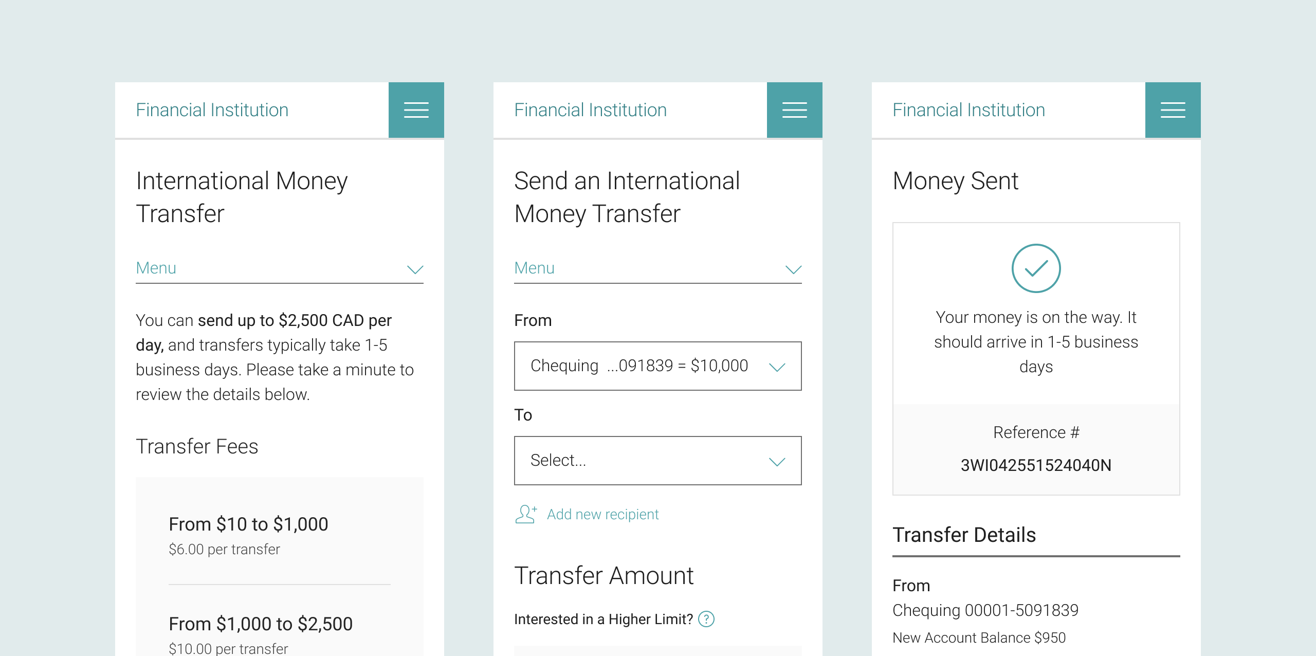
Access to Funds
internship project

Overview

Allowing clients to access a higher limit when sending an International Money Transfer (IMT)

During my Visual Design internship with the Royal Bank of Canada (RBC). I collaborated on this project with a Product Owner, a Business Analyst, Developers, and other Designers. I contributed to the visual exploration, UX design, prototyping, usability testing, and research synthesis.

Type

UX / Visual Design / User Testing

Timeline

August 2022

Tools

Figma / UserTesting.com

Final Product

Breakpoints

Working with Developers, it was crucial to recreate the screens on various other breakpoints, including extra small (mobile) and medium (tablet). We aimed to maintain consistency for visual hierarchy, while adapting each screeen to better suit the device size on which it was displayed.

Various breakpoints (XS and tablet screens)

Business Requirements

Scope

The clients are to be offered a higher limit when sending an International Money Transfer (IMT). We will also allow clients to view and keep track of their daily remaining limit for IMTs. In phase 1, clients would need to log into the mobile application to access multi-factor authentication and see if they qualify for a higher daily transaction limit. In phase 2, clients would be able to see if they qualify for a higher limit through Online Banking.

Painpoints

With the existing system, the client experiences a variety of painpoints when having to send over $2,500 — which is the current Daily Transfer Limit. To better understand the user, we outlined some of the main ones.

The client has to wait until the following day to send another transaction

The client must pay multiple transfer fees when sending funds over $2500

There is no indication within the system regarding the client's remaining balance

Considerations

There are also a variety of considerations that need to be taken into mind when evaluating potential approaches. Not every client will be eligible for an increased limit, so the system has to clarify that it is a potential increase and we must be cautious as to not mislead the client. We also don't want any messaging to seem promotional, as it could appear deceptive or be missed by the user due to "banner blindness". Overall, we need to ensure that our system remains upfront, reliable, and trustworthy.

Heuristic Evaluation

Our team considered three pages for the added functionalities to IMT – the IMT Landing page, Transfer Details page, and final Confirmation page. Through a heuristic evaluation, we weighed the advantages and disadvantages of each approach.

IMT Landing page, Transfer Details page, and final Confirmation page on XS screens

Landing Page

The information is upfront, and offers transparent communication with the client. However, users tend to click on the call-to-action without thoroughly reading through the other content on the page, which can make it possible to miss.

Transfer Details

Our team felt that this option seemed the most relevant as it's where the clients are conducting transfers, and the placement is more likely to help clients avoid multiple transfer fees. Although, we also determined that it might lead to a potential overload of information and could be difficult to integrate it with existing components.

Confirmation Page

Adding the messaging at the end will not interrupt the transfer flow, which could improve the transfer experience. However, the disadvantages seemed to greatly outweigh the potential benefits, as this option is not as upfront and lacks transparency. Moreover, clients often don't take the time to review the information on confirmation pages, and would likely miss it. Thus, we decided to feature the messaging on the Landing page, and make it available as a tooltip in the Transfer Details page.

Visual Exploration

Banner

Referring to illustrations and components available in the Financial Institution's interface guidelines, we explored various methods of presenting the messaging on the Landing page. We wanted it to be an eye-catching element on the page, while also ensuring that it wouldn't be perceived as promotional.

Exploration for banner visuals

Limit Display

Our team also explored different approaches to displaying the limit display information, to find a layout that could be easily understood by the client.

Exploration for limit display

Usability Testing

Objective

We conducted usability Testing with existing clients to gain insight into areas of improvement, and ensure that our approach offered a positive user experience. The testing was performed to support phase 1, and understand client experiences around requesting higher limits, clarity of content and inform future work on phase 2.

Process

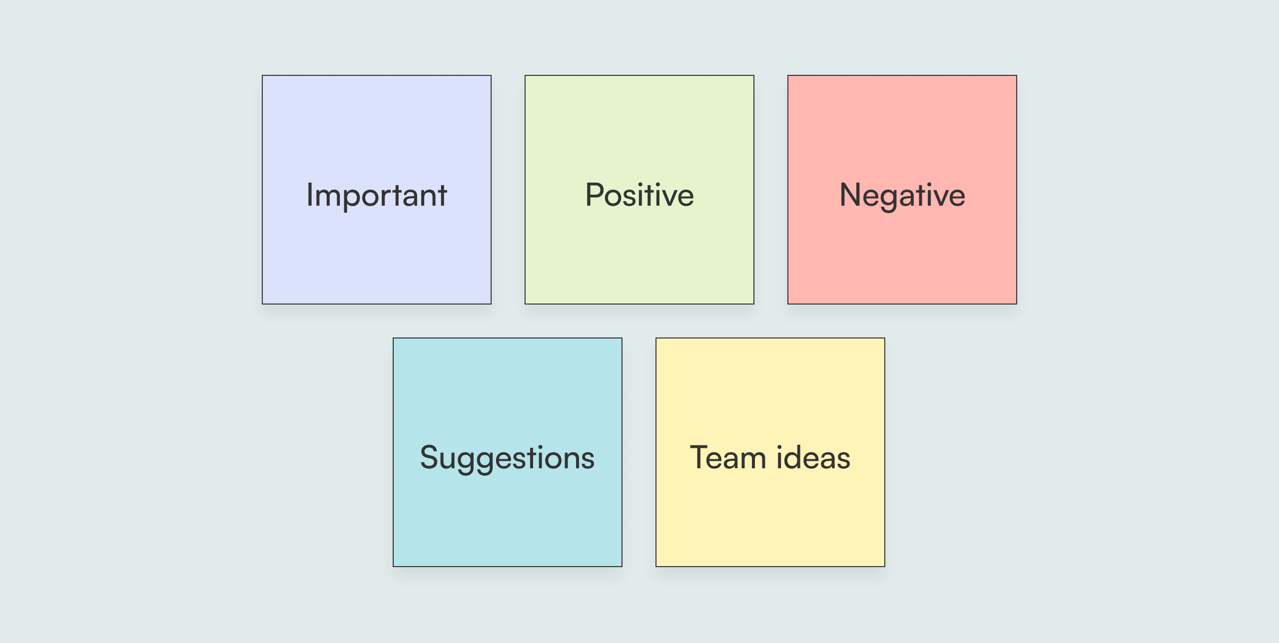
The Design Researcher prepared a research outline, and a number of questions to walk the client through the flow and prompt further thinking. We had eight 30-minute sessions, and I was fortunate to have the opportunity to act as an observer, note-taker, and even as a moderater! We colour-coded our notes to organize them into 5 categories: important, positive, negative, suggestions, and team ideas.

Categories of sticky notes

Key Insights

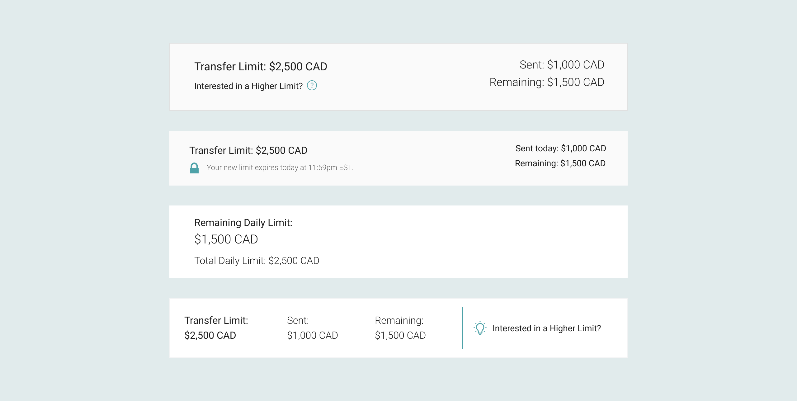
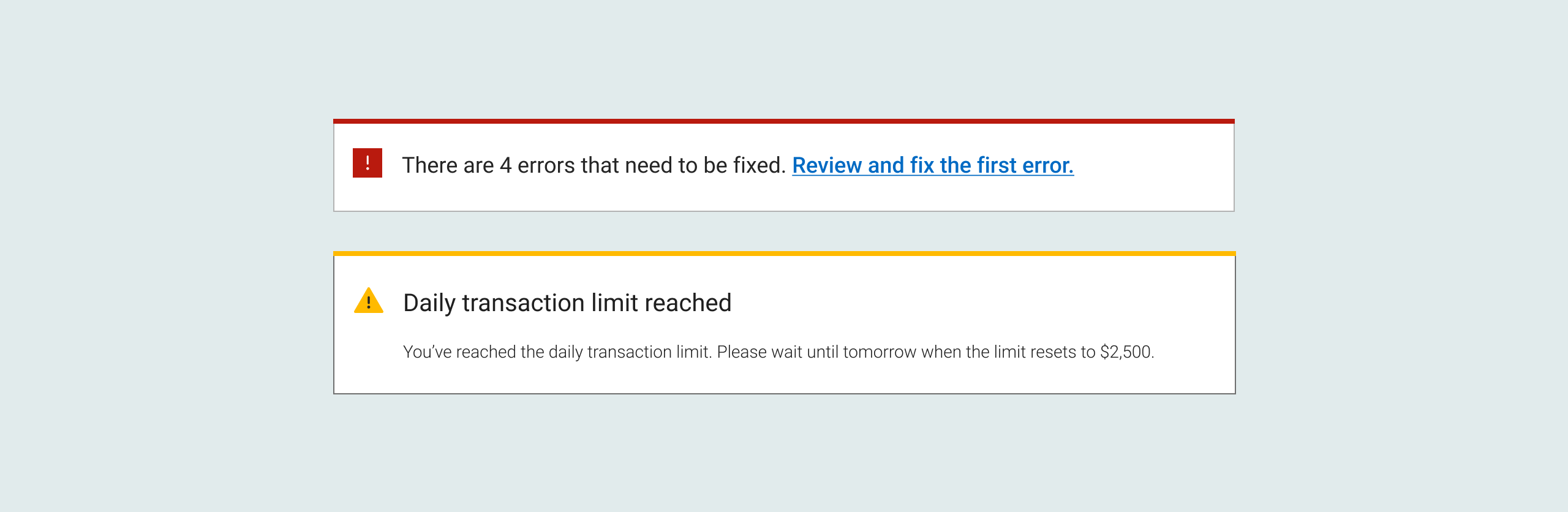
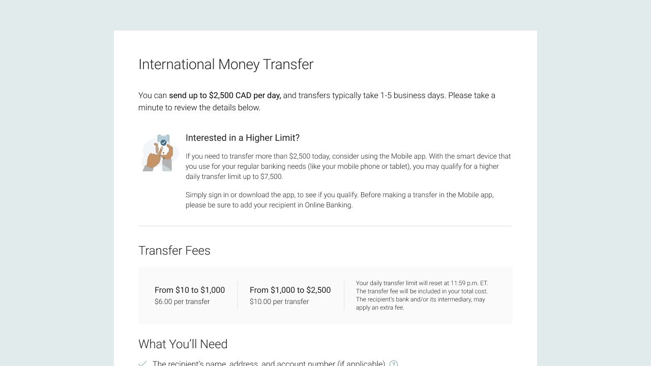
From the usability testing sessions, we gained a number of insights that helped us narrow in on our direction. These were some of the major ones, and "How Might We?" questions to consider.

Confusion about limits

HMW provide clients with information about IMTs, limits and the transfer experience?

Skipping over info

HMW ensure limit information is easily identified and presented at the right moments?

Lacking transparency

HMW explain trusted devices and mobile app limits without compromising security?

Final Steps

Refining the Design

To address the HMW questions developed in response to the usability testing, we outlined a few of our next steps. We needed to clarify the various limits by including more specific language, and decided to lay them similarly to the Mobile app. We also decided to include a longer description on the landing page, and reiterate the messaging on the transfer details page. These changes would better align our flow to the Financial Insitution's values of being upfront, reliable, and trustworthy.

Working with Developers

Our team of designers produced pixel-perfect flows using the Financial Institution's component library, so that developers could implement it into the website. We also considered the possibility of different error scenarios, and created mockups to represent how they would show up.

Error banners

Moving forward

To finalize the project, we would have met with the accessibility team to ensure that the design would remain accessible through the development of the product. Following the development of the feature, we would test the flow to ensure there are no bugs and that the functionality works as planned. In order to measure impact, the Business Analyst would measure how many people start the flow through Online Banking, and how many complete the transfer to mobile. For extra small breakpoints, we would also create a link to access the mobile app. Further into the future, we would start on phase 2 of the project.

Final Flow

Return to Homepage